Applying for a new job is a nerve-wrecking and exciting experience for most people, especially if it’s your first job. Here’s my advice from an interviewer’s standpoint.
At my previous employer, I held my fair share of follow up interviews during my close to five years at the company. At this stage, the interviewee had already had one successful interview with his or hers, perhaps, soon to be boss.
The follow up interview focused more on getting to know the interviewee and usually asking some tech or design questions. If they passed this interview, they went on to negotiate a contract.
I think I held around eleven or twelve of these follow up interviews. Here are my advice to you job seekers out there.
1. Be on time
Yes, this is a no-brainer. For an interview you must be on time. Otherwise, you’ll give a terrible first impression.
If you happen to get stuck in traffic and think you might be late, let the interviewer know. No decent company would hold this against you.
After spending four and a half years at HiQ in Stockholm, I quit this September.
It was a tough decision. I’ve learned a lot, worked on cool projects and met so many lovely people at this company.
After taking some much needed time off and doing some traveling along the US west and east coast (check out my Swedish travel blog), I started my new job as a UX Designer at inUse this week.
Here I’ll continue working with Mobile First, Responsive Web Design, accessibility and usability stuff in general.
When working on solo projects, both at HiQ and on my spare time, I tend to use Git for version control.
I always put the repository on Dropbox for easy backup. This is quite easy if you’ve worked with Git before, but probably not for a total newbie. This tutorial is for all you newbies :)
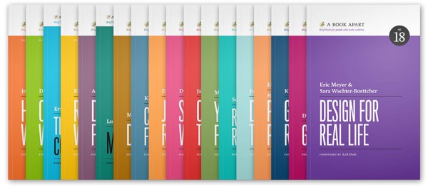
Yes! Apart from blogs, video tutorials and Twitter accounts you can still learn lots of great stuff about UX design by reading a book printed on paper.
Here are my favorite books I think you should read!
The A Book Apart Series
A Book Apart (@abookapart) is not a single book. It’s a series about everything related to web, from HTML markup to content strategy. I’ve (almost) read all of them and they are by far the best books to read if you are working with websites in any way.
The series cover the following:
The new stuff in HTML5
The new stuff in CSS3
Advice for your content strategy and mobile content strategy
Advice for working as a designer and dealing with clients
Arrows are common in the interfaces we interact with on a regular basis. Since they are used so frequent and in many different ways, they are easily misused leading to a confusing user experience.
My goal with this post is to categorize the usage of arrows, show some examples and give you some pointers (pun intended) if you’ve decided to use arrows in your interface.
Buttons and links
Arrows are sometimes used with buttons or placed next to links in order to make them more noticeable and clickable.
The classic iOS back button made to look like an arrow hinting clicking it will bring you back one step.A link to a new page at m.adlibris.se.
I’m very skeptical towards placing arrows before or after regular links. A blue underlined piece of text looks more like a link and an arrow next to the text might fool the user thinking a click will expand more content instead of navigating to a new page.
Position indicators
Check out breadcrumb trails on some sites and you’ll definitely see multiple arrows pointing to the current section.