Arrows in interfaces
Arrows are common in the interfaces we interact with on a regular basis. Since they are used so frequent and in many different ways, they are easily misused leading to a confusing user experience.
My goal with this post is to categorize the usage of arrows, show some examples and give you some pointers (pun intended) if you’ve decided to use arrows in your interface.
Buttons and links
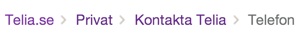
Arrows are sometimes used with buttons or placed next to links in order to make them more noticeable and clickable.
I’m very skeptical towards placing arrows before or after regular links. A blue underlined piece of text looks more like a link and an arrow next to the text might fool the user thinking a click will expand more content instead of navigating to a new page.
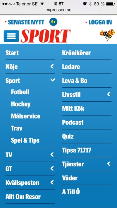
Position indicators
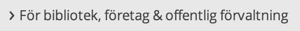
Check out breadcrumb trails on some sites and you’ll definitely see multiple arrows pointing to the current section.
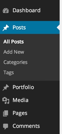
Left panel navigation menus can use an arrow to show which page you are currently at.
Extras on demand components
Arrows are frequently used in elements for displaying and hiding content. In my opinion, this component is the most inconsistently designed component on the web today when designed using arrows. It has the following inconsistencies:
1. Placement
The arrow is either placed to the right or to the left of the text. If placed to the right it looks similar to links, especially in responsive navigation menus. Thereby, it isn’t obvious if clicking it will show more content or navigate to a new page.
2. Direction
When the component is closed, the arrow points to the right, left or down. When the component is open, the arrow points down or up. No consistency whatsoever.
3. Behavior
Sometimes the arrow changes direction when toggling the content, other times it stays the same. Inconsistency for teh win.
4. Examples
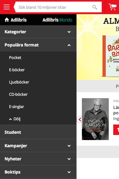
In my opinion arrows should be placed to the left pointing to the right when closed and down when opened. Why? Because…
- It’s recommended by Jenifer Tidwell in her excellent book Designing Interfaces.
- This design is the most popular based on my observations
- Links with arrows tend to have the arrows to the right.
Note: An extras on demand component doesn’t have to use arrows. The characters + and – are can also be used. Check out the menu on stockholm.se on a mobile device.
Common icons
Arrows are also used for common interface icons such as:
Visual cues
Apart from in elements you can interact with, arrows are also used to simply guide your eyes to important content.
I know I’ve read a similar post on this about two years ago. If anyone happens to know which one I’m thinking of, post it in the comments sections below along with other uses of arrows I might have missed.
/Alex