Every year around this time, I go through and evaluate my digital toolbox of web apps, Figma plugins, and macOS apps. This year was no exception, so here’s what I use for saving time on a daily basis.
I’d describe Pixelmator Pro as a simple and slimmed down version of Photoshop. I’ve been using it for close to ten years and it covers all the image editing I can’t do in Figma. Recently, I noticed it also has some neat AI-powered tools for retouching photos. It currently costs $49.99, but it’s worth it!
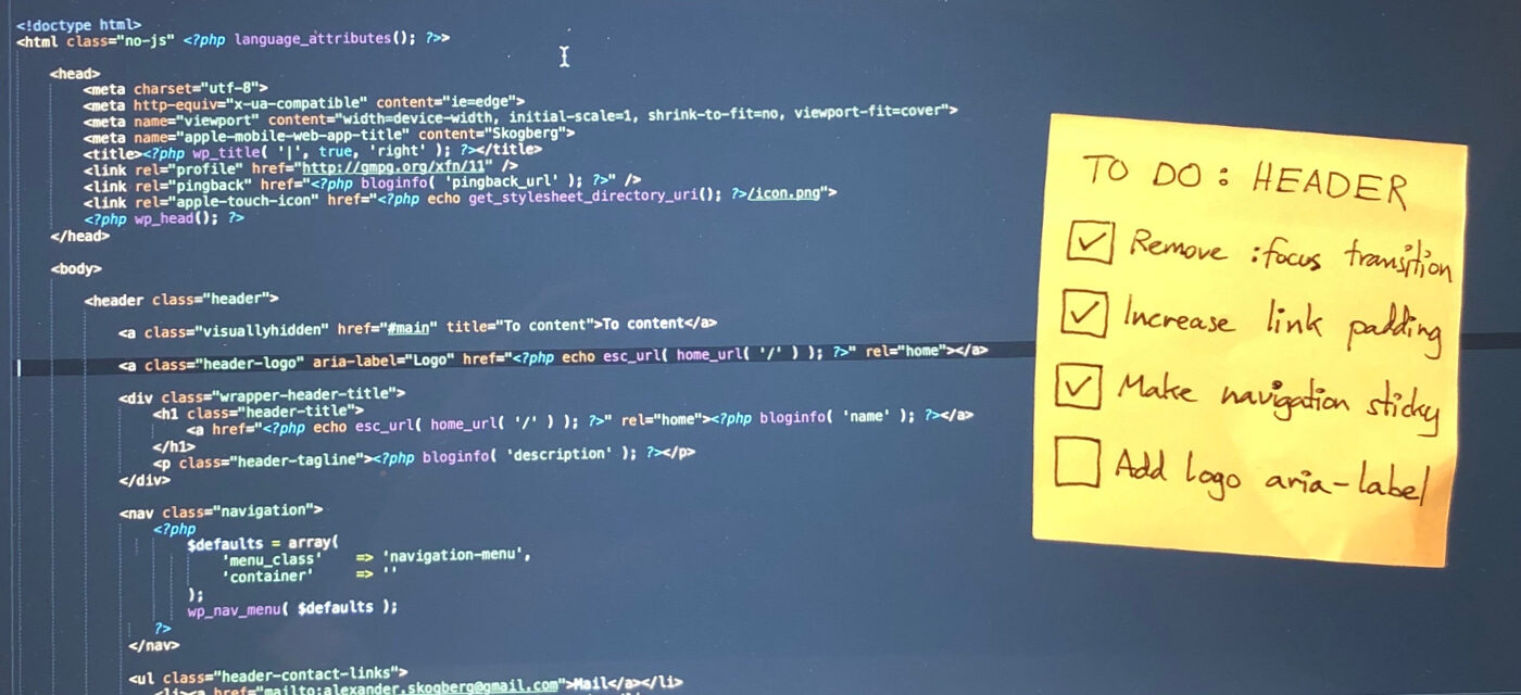
Over the years, I’ve learnt that a great developer experience plays a large part in a successful project. Here are my tips for contributing as a designer.
For the past eight years, I’ve been working as a UX designer and frontend developer in Stockholm, Sweden. When I look back on the projects I’ve been a part of, the ones that were successful and provided a great user experience always had a great developer experience. When it was neglected, the projects often fell short of set expectations.
Developer experience (DX) could (somewhat oversimplified) be described as user experience (UX) for users that are developers.
Rockstar Games’ long-awaited title Red Dead Redemption 2 was released on October 26, 2018 and has been met with enormous praise. In this post I go through the good, the bad and the ugly UX of this western epic that most likely will go down in history as one of the greatest games of all time.
After releasing Grand Theft Auto V (GTA V) in 2013, Rockstar Games has had gamers waiting patiently for the follow up to their 2010 smash hit wild west adventure Red Dead Redemption.
In this prequel to the previous instalment you play as Arthur Morgan, a member of the Dutch van der Linde gang just like the previous game’s protagonist John Marston. Arthur is trying to make a life for himself and his fellow outlaws after a failed bank robbery in the rapidly changing and less and less wild west.
As Arthur faces both opportunity and hardship, you as a player will face both good, bad and ugly UX.
The nature, architecture, people, language, food and culture. During my trip to the mesmerising country of Japan in October this year, I felt there was no end to the impressions I got. In this post, I’ll tell you what stood out about design.
Was it playing Super Mario World as a kid in the early 90s? Could it have been eating sushi when going to college on the Swedish west coast? Maybe seeing Sofia Coppola’s masterpiece Lost in Translation multiple times had something to do with it.
I don’t know, but for the past few years my curiosity about Japan had been steadily increasing. This fall I finally stopped dreaming and booked a flight to the land of the rising sun.
In this post, I’ll tell you what made impressions on me as a designer.
User interface design is hard. Smartphones, tablets and laptops come in all shapes and sizes with and without keyboard, mouse and touchscreen input. For making your design great in this context, you must first learn to break your design.
Too often in projects I’ve seen design fail late in the development process due to it not being tested enough in different ways. This waste of time and energy can easily be reduced.
There are several reasons for this failure. Sometimes it’s stress, last minute content changes or unclear initial requirements. But sometimes it’s simply because we designers can be unstructured and sloppy. We need to get better, we need to start breaking our design before someone else breaks it for us.
Here’s my guide for putting your design through the wringer.
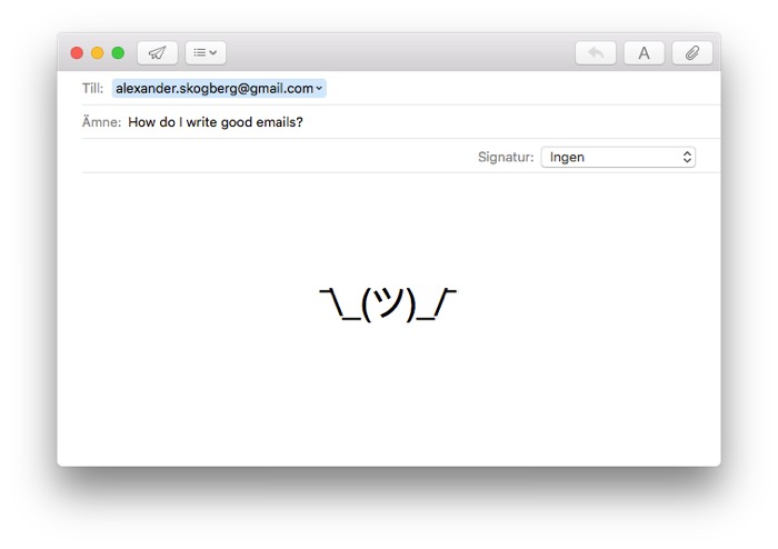
Email. Love it or hate it, you probably have to use it on a daily basis anyway. Here are my best tips for writing emails people will read, understand and (most importantly) reply to.
I’ve sure sent my amount of crappy emails over the years. Emails with vague subject titles, unnecessary CC:s and forgotten attachments. Once, I’ve even hit the Reply All button and sent an email to over 500 coworkers.
I’m always trying to write fewer and better emails and faster and more helpful replies. However, I can always get better and so can you. Now, I’m gonna teach you how!
There are lots of great tools for drawing wireframes today. However, I still prefer my good ol’ paper wireframing kit. In this post I’ll tell you why and explain how paper wireframing will make you a better designer.
In 2012 I was planning on taking my wireframing skills to the next level. I had gotten the excellent app Paper by FiftyThree for my new iPad and had ordered two well-reviewed tablet sketching pens all the way from the US.
Around this time, I also took a paper sketching course by the Swedish designer Mårten Angner. Taking this course completely changed my approach to making wireframes and over the years it has made me a better designer.
Let me tell you why paper wireframing is a must-have skill.