
Making your design by breaking your design
User interface design is hard. Smartphones, tablets and laptops come in all shapes and sizes with and without keyboard, mouse and touchscreen input. For making your design great in this context, you must first learn to break your design.
Too often in projects I’ve seen design fail late in the development process due to it not being tested enough in different ways. This waste of time and energy can easily be reduced.
There are several reasons for this failure. Sometimes it’s stress, last minute content changes or unclear initial requirements. But sometimes it’s simply because we designers can be unstructured and sloppy. We need to get better, we need to start breaking our design before someone else breaks it for us.
Here’s my guide for putting your design through the wringer.
Break your design with real content
Every designer I’ve ever spoken to has agreed that using real content as early as possible is the way to go. Yet, I often see design filled with placeholder images, Lorem Ipsum text and comfortable made-up content.
While this type of bogus content is fine for styling typography, experimenting with layout or playing around with interface components, it doesn’t match reality. When replaced with actual real content, the design breaks along with the user experience.
If there’s no real content available, write it yourself. Someone has to get it started, it could just as well be you.
Short, long and foreign names
When it comes to having names in your user interface, I recommend using names of Brazilian football players. They all have short and cool stage names, while their actual names often are much longer.
It’s also smart to test your design with foreign names, since they might contain characters not included in the typefaces you’re using.

Long words and line breaks
It’s not only names that can be long and tricky when dealing with text.
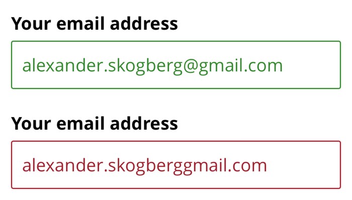
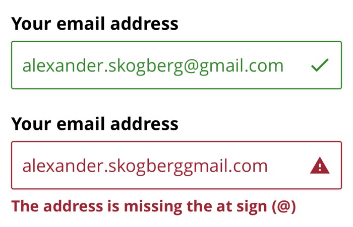
For example: Email addresses, phone numbers and different types of ID numbers often don’t contain spaces and can get long. Strings of text like these will break your design if you haven’t thought about how to handle line breaks when you run out of horizontal space.
Handling these long pieces of text gets even more challenging when they need to be put in components such as data table cells, tabs in a tab bar or in large headings.
Images in uncomfortable formats
About images, don’t expect to receive high resolution images in a specific format. Make sure your design handles images in uncomfortable formats too. The end result doesn’t have to be pixel perfect, as long as the components or layout end up completely broken.
Tip: For websites, you can handle images well with CSS properties like object-fit and background-cover.
Break your design by removing color
People with color blindness and other forms of visual impairment have a hard time or simply can’t differentiate between colors. Some rely on assistive technologies that override the chosen colors in your website or app. This is something I’ve seen myself and it can really mess up the user experience.
Therefore, stripping your interface of color is another way of breaking your design (and finding accessibility improvements at the same time).
Here are two examples, one that breaks and one that doesn’t.
Break your design using touch input
Handling touch input is easy to down-prioritise and get lazy with when you’re primarily designing for larger screens and not for smartphones and tablets. Ignoring this can break your design too.
Laptops have touchscreens now
designing for large screens is no longer a guarantee that you don’t have to design for touch input. Today, tablets like the iPad Pro and Microsoft Surface are larger than many laptops and more and more laptops come equipped with touchscreens (some are even removable). The Microsoft Surface Book series is a good example.
When designing for modern devices like the Microsoft Surface Book 2, your design must always be prepared for users switching between input from mouse to keyboard to touchscreen.
Space between large clickable areas
Make sure there’s enough space between clickable elements and that the elements themselves are large enough to click on. WCAG 2.1 and the Apple Human Interface Guidelines recommend a minimum size of 44 × 44 pixels.
Remember that a clickable area can be larger than the visual appearance of its element. Your icon can still be 22 × 22 pixels as long as it has padding around it making the total clickable are large enough.
Break your design with mobile first
Nothing breaks a design as hard as when space is decreased and content doesn’t fit as easily. But if this happens, you haven’t done good enough work to begin with.
Don’t start designing for large screens. It sure is tempting with all that screen real estate, but don’t do it! You might get lazy, stop questioning content and keep visual design bloat you otherwise would have gotten rid off right away on small screens.
I recommend working mobile first. With this approach, you’ll be forced to put your design and content through a bootcamp, get smarter about space and question and remove bloat. You’ll encounter less problems you otherwise would crash into later if designing desktop first.
Start from 320 pixels
Start designing for 320 pixel wide screens and size your way up. According to screensiz.es, 320 pixels is the minimum width of popular smartphones today. WCAG 2.1 also says users should be able to browse a website on a screen of this size without having to scroll horizontally (apart from some exceptions).
If your interface components work well on small screens, they will work well on all screens.
Break your design with help from developers
Let’s say you’re designing a search page for a website that sells stuffed animals. You’ve probably designed how the page looks:
- Before a search has been made.
- With just a few search results hits.
- With lots and lots of search results hits.
But have you thought about:
- When a search returns nothing?
- There’s a scheduled maintenance?
- When a search fails due to an error?
- How the page looks while a search is being performed?
You probably won’t remember all of these variants every time, but I’ll bet good money that the developers you’re working with will! Make sure to include them in the design process.
Draw wireframes together, have them review your clickable prototype and and ask them to point weaknesses and vague details. Developers are masters at breaking design, take advantage of it!
Finally
Using real content, removing colors, working mobile first, always testing with touch input and asking developers for help are all excellent ways for breaking your design.
If you don’t break your design, someone else definitely will.
Do you have any more tips for breaking design in creative ways? Please let me know in the comment section.
Update 1: I got reminded that the disability simulator Funkify is excellent for breaking your design. If your design has accessibility flaws, this Chrome plugin will help you find them.
Update 2: Even if you follow all of my tips above, make sure to always do some usability testing. Following best practices and designing for edge cases will take you far, but usability testing will always take you further.
/Alexander