Stop placing the menu button in the wrong corner
Posted on September 17, 2013
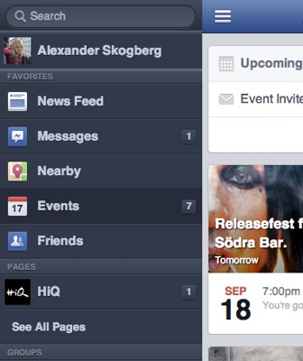
One of the most popular navigation patterns for apps and responsive websites is broken. I’m talking about the left navigation fly out, which was made popular by Facebook a year or two ago and since then has spread like wildfire.
Don’t get me wrong. This navigation pattern has many pros. For example:
- It can hold lots of content
- It doesn’t take up much space when closed
- It’s very common
But it it has one major flaw. The toggle button is placed in the most hard to reach area on a smartphone screen – the upper left corner.
Why not the upper left corner?
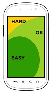
According to studies 70 – 90 % of the world’s population is right handed and people often use their smartphones with just one hand, being their right. Just look around when you’re out around people next time. This makes the upper left corner the hardest area to reach on a smartphone screen.
In his great article Responsive Navigation: Optimizing for Touch Across Devices, Luke Wroblewski (@lukew) discusses the importance of placement of navigation elements on responsive websites. In the article he includes the following image that explains the problem with the upper left corner perfectly.
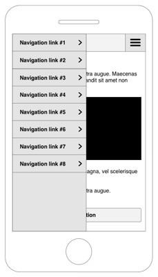
The solution = the right corner
I suggest to simply place the menu button in the upper right corner of the screen and have the menu appear above the content, instead of shifting it to the right as Facebook does. Apart from solving the issue discussed above it also removes the annoyance of the menu button being shifted from the left, to the right, and back when the menu is toggled. I can’t be the only one finding this annoying?
Here’s a sketch of my take on the left navigation fly out pattern.
What’s your favorite responsive navigation pattern and what do think of my solution? Let me know in the comments section below!
/Alex