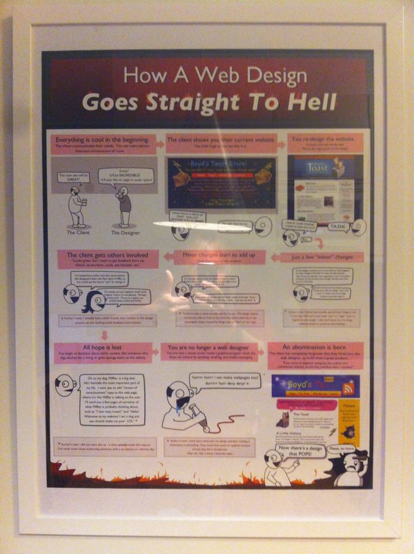
The world’s greatest poster is hanging on my apartment wall
Posted on September 6, 2013
Unless you’ve been living under a rock (or been without Internet access) for the past four years you’ve probably visited The Oatmeal – the article and comics website created by Matthew Inman (@Oatmeal).

I cannot articulate my love for Inman’s fantastic, weird, smart, thoughtful, provoking, geeky and just plain awesome content he has put out throughout the years. However, one piece that has stood out for me is his poster How A Web Design Goes Straight To Hell.
“Well, isn’t it a bit exaggerated?”, you might think. It’s not. It’s the hard truth! You’re not a true web designer unless you’ve experienced a design process like this.
I have.
Once.
But that’s another post.
So anyway, I ordered the poster and some other items a few weeks back and now it hangs on the wall of my kitchen and makes me smile every morning.

How A Web Design Goes Straight To Hell – the poster probably every web designer has laughed at or cried about.
Make sure to check out Inman’s work and order a piece or two. Here’s five other favorites of mine:
- Why Nikola Tesla Was The Greatest Geek Who Ever Lived
- When Your House Is Burning Down, You Should Brush Your Teeth
- How To Suck At Your Religion
- My Dog: The Paradox
- I Tried To Watch Game Of Thrones And This Is What Happened
What’s your favorite stuff at The Oatmeal? Let me know in the comments section below.
/Alex