Hey designers, take more responsibility for website images!
Today, images stand for about 50 % of a website’s total weight. Since poor performance is so tightly linked to decreased revenue and dissatisfied users, we designers must take more responsibility for website images.

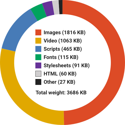
Websites keep getting heavier and heavier. According to data from httparchive.org, the average website weighed 3686 KB on February 15, 2018. Six years earlier (February 15, 2012), the average website used to weigh 986 KB.
Websites have become 373,8 % heavier during the last six years. It’s mind-blowingly bad!
Video stands for a large part of a website’s weight today compared to a few years ago, but the largest contributor to the total weight is still images.
Why performance matters
When arguing for the importance of good performance, it’s easy to find supporting research.
40 % of users and 53 % of users on mobile devices leave a website that takes more than three seconds to load according to AMP Project and Kissmetrics.
Luke Wroblewski presents harsh statistics when it comes the negative effects of poor performance.
As you can see, poor performance is likely to result in a poor user experience and financial losses.
Reasons for the weight gain
I think there are three main reasons why images on websites are being handled so poorly.
First, it can be difficult to tell where designers’ responsibilities end and where developers’ responsibilities start when it comes to designing and developing websites. This combined with assumptions of who’s doing what is a terrible combination.
For example: Who should compress images? The designers choosing them or the developers uploading them? Shouldn’t the content management system (CMS) for the website compress the images automatically?
Second, a lot of designers simply don’t know how bad website performance is getting, how much images are to blame and how it affects the user experience and revenue. I’ve even met designers who don’t take the matter as seriously as they should, even when presented with hard facts.
Third, designers are not aware of all great tools and techniques available to handle images like a pro. This might be the biggest reason of them all.
How to handle website images like a pro
So, let’s get specific! I’ve put together a set of questions you and your coworkers should ask yourselves when working with images. Don’t worry, you’ll get the answers too.
Are all images really needed?
Images can be essential for your content and make your website look fantastic. But even if your images are being handled excellently, there still might be so many of them that performance will be hurt anyway.
Question every image you have added and think of adding to your website. Is it really needed? Does it make the content better or are you adding it just because it looks great?
Is any image a vector illustration?
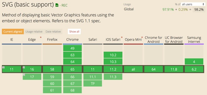
If the image you’re working on is a vector illustration, you shouldn’t export it to a JPG or PNG. Instead, export it to the lightweight and dynamic SVG format.
There’s no major issues using SVG in production today when it comes to browser support. According to caniuse.com/#feat=svg, you can use SVG images even for Internet Explorer 9.
Must the image have a transparent background?
Images saved in the PNG format usually weigh much more than images saved in the JPG format. If your images don’t need a transparent background, then always export them to JPG.
Are you compressing images as well as possible?
Many designers I’ve spoken to think the “Save for web” option in graphic editors like Photoshop and Pixelmator is good enough for compressing images. However, compared to tools like TinyPNG and JPEGmini this export option doesn’t stand a chance!
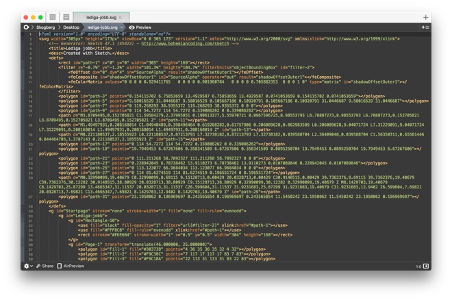
SVGOMG
SVGOMG is a web app available at jakearchibald.github.io/svgomg that removes unnecessary information from a SVG files.
Graphic editors have a tendency to include information like comments, editor metadata, hidden elements and so on. This type of information can be deleted without affecting what’s rendered.
TinyPNG
TinyPNG is web app available at tinypng.com. If your images must have a transparent background, you should use it.
JPEGmini
JPEGmini is easily the best JPG compression tool I ever used. Most of the time it compresses image file sizes to 50 % or more, without any noticeable drop in quality.
Want proof? Look at the following two images I recently took with my iPhone 8S. The first one is compressed just using Pixelmator. The second one is compressed using JPEGmini.

JPEGmini is available for Windows and for macOS on jpegmini.com/app. Buy it, you won’t regret it!
Are responsive images being served?
If your website is not serving its visitors responsive images, you’re making a heavy mistake!
Users visiting your website on mobile devices with shaky Internet connections don’t have the patience nor bandwidth to download large images designed for wide screens. Instead, these users should be served scaled down versions of the same images designed for their smaller screens.
Luckily, many content management systems offer responsive images today. The world’s most popular CMS, WordPress added this in December, 2015.
Have a look at the following code snippet. It’s the classic HTML img tag, but with added attributes for enabling responsive images. The wider the screen gets, larger images will be loaded.
For example: For small screens, example-small.jpg is loaded. But if the screen width is 660 pixels or wider, example-large.jpg is loaded instead.
<img src="example-small.jpg"
     srcset="example-large.jpg 660w,
             example-medium.jpg 520w,
             example-small.jpg 380w"
     sizes="(max-width: 660px) 100vw, 660px">
If you want to learn more about responsive images, read Responsive images with srcset and sizes by Dutch web designer Wouter van der Zee.
Are lots of images being loaded outside the viewport?
If your website loads lots of images outside the viewport, it’s a good idea to wait and not load them until they actually show up in the viewport.
This is a classic technique called Lazy Loading. Have a look at the library unveil.js for learning how it works.
Finally
Handling website images in a sloppy and poor way will sabotage the user experience of your website and make your company lose money due to the likely negative impact on performance. Luckily, there are lot of tools and techniques you as a designer can do to prevent this.
Do you have more advice on how to handle images on a website? Let me know in the comment section.
/Alexander