The usability delights of Witcher 3: The Wild Hunt
Posted on February 23, 2017
One of my New Year’s resolutions was to post here on a more regular basis, but then I (finally) started playing Witcher 3: The Wild Hunt… So, to break my procrastination I decided to write a post about the usability delights of this wonderful game.
The Witcher 3: The Wild Hunt is the third game in the epic fantasy saga from the Polish game developers CD Projekt Red. It was released on May 19, 2015.
The Witcher games are based on the fantasy books by Polish writer Andrzej Sapkowski. The books tell the story of the witcher (monster hunter) Geralt of Rivia, whom you also play as in all of the Witcher games.
I won’t go into great depths about the story of the game. If you’re interested, read A Beginner’s Guide to the World of the Witcher by Kotaku. The lore is as epic as in The Lord of the Rings and the politics is as complicated as in Game of Thrones.
But in short, You play as Geralt who is looking for his adoptive (sort of) ultra powerful daughter Ciri who is lost in war-torn world and being chased by a group of scary specters called the Wild Hunt.
Just as its backstory, the mechanics and interfaces of Witcher 3 are deep and complex. But CD Projekt Red has pulled it off remarkably well. Here’s six of my favorite usability delights of this game.
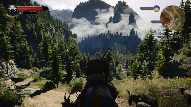
1. No crashing into trees on horseback
I’ve played quite a few games where you spend time on horseback. Mainly Nintendo’s classic Legend of Zelda games, but also Rockstar Games’ western epic Red Dead Redemption. I’ve always found it incredibly frustrating when you’re gloriously blazing through a field with the sun setting in the background only to be abruptly stopped when crashing into a tree. Ugh.
In Witcher 3, this is almost never happens. Even when you ride into the most dense of woods, you are subtly auto-aimed past the many trunks and branches. It’s such a welcomed change. Well done CD Projekt Red.

2. Autopilot when riding to quest locations
Like most sandbox games, Witcher 3 will make you spend quite some time on foot or horseback when moving from one location to another.
From time to time, you’ll be going back and forth between locations so frequently that the excitement of discovery will be replaced by the feeling of commuting to work.
Luckily, if you decide to travel on horseback you can just hold the sprint button to active the autopilot feature. By doing this you’ll be ridden to the next location without having to steer your horse at all. Wonderful.
Witcher 3 also offers you to fast travel from and to certain sign posts found throughout the map. You have to discover them before being able to use them though.
3. Highlighted and marked dialog options
Apart from horseback riding, crafting, sword fighting, playing the card game Gwent and looting, you’ll be doing a lot of talking in Witcher 3.
Exploring all dialog branches is encouraged, since you will unlock subquests and learn useful information.
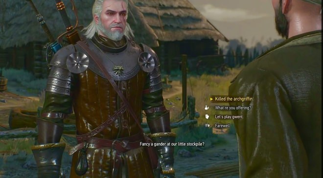
However, if you’re in a rush and don’t have time to explore all branches, the option (or options) that will bring you closer to finishing the current objective is highlighted in yellow. Simple, yet helpful.
Scattered throughout the giant world of Witcher 3 are also armourers, blacksmiths, herbalists, merchants and so on. While you can have regular conversations with these folks, the dialog options that let you play Gwent, sell loot, craft armour, forge weapons and so on will be marked with their own specific icons.
Doing this let’s you find the wanted option right away, without having to read and interpret the different options. Basic and smart use of iconography.

4. Configurable HUD
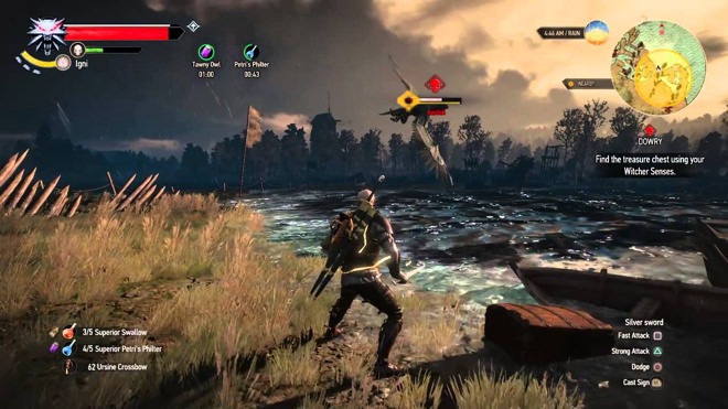
Since there’s so much information to think of Witcher 3, the HUD can become a bit overcrowded and after a while you might not need to see certain bits of information all the time
Thankfully, the HUD is very configurable. You can position it, scale it and toggle information such as:
- Minimap
- Path to objectives
- Active quests
- Control hints
- Damaged weapons
- Critical hit and effect text
- …and much more
Since Witcher 3 is such a beautiful game, you don’t want too much stuff on the screen covering up its visual glory.
5. Suggested level for quests and monsters
Witcher 3 is a very long game. Throughout it you’ll grow stronger, but so will the enemies you encounter.
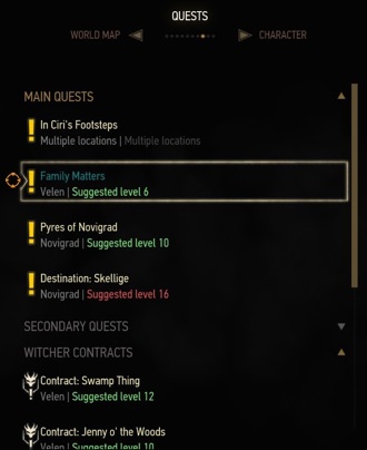
This means certain quests you stumble upon might be too tough to take on at the moment. Instead of making you discover this the hard way, each quest has a suggested level in the quest menu.
This simple design detail will save you time and frustration, but also give you lots of satisfaction when you try and complete a quest with a higher suggested lever than your current level. Overachieving has never felt so good.

The monsters you encounter also have their level shown next to their health bars. Certain monsters might be so much tougher than you that they will be marked with a red skull, meaning a certain death for Geralt.

6. NPCs follow your pace
For those of you who have played games like Witcher 3 know that from time to time you have to follow a NPC (non-player character) from one location to another.
This is usually frustrating when you have to keep their pace, but fail and end up moving too slow or too fast.
In Witcher 3, this is not an issue. If you run, the NPC runs. If you walk, the NPC walks. Fantastic.
There are some exceptions, but the ones I’ve encountered so far have been validated by the context of the quest.
Any bad stuff? Yes, saving manually
Doing a manual save is cumbersome if you’re playing Witcher 3 on a console.
You have to:
- Pause the game
- Go to the save section from the main menu
- Select a specific slot to save on.
- If the slot already is used, you have to confirm overwriting the older save data.
Since it’s considered good practise to save manually often in Witcher 3, this is frustrating. Saving on a PC is easier, since you can bind the save action to a certain keyboard key.
Yes, there’s an auto-save feature but you’re gonna want to save manually regardless.
Wrapping up
Apart from the minor issue with saving manually, I’m blown away and overjoyed with what a fun, addictive, solid and incredibly well designed game Witcher 3: The Wild Hunt is.
When writing this post, I’ve been playing for roughly 25 hours and only finished about sixteen percent of the game. Thankfully it won’t end soon, because when it does I’ll probably need to see a therapist. It’s that good :)
What about you? Have you played Witcher 3: The Wild Hunt? Share your thoughts of the game in the comment section.
/Alexander