The new guidelines in WCAG 2.1 explained
Posted on February 15, 2018
In the Summer of 2018, WCAG 2.0 will be updated to version 2.1 with new guidelines for making websites even more accessible. In this post I’ll try to give simple explanations of these guidelines along with thoughts and advice on how to follow them.
WCAG stands for Web Content Accessibility Guidelines and is an International established set of guidelines for accessible content on the Internet. These guidelines are mainly for people with various disabilities, but also for different devices used for browsing websites.
WCAG is maintained by the World Wide Web Consortium (W3C), the main standards organisation for the Internet. The current version (WCAG 2.0) was published in 2008 and became an ISO standard (ISO/IEC 40500:2012) in 2012.
In the Summer of 2018, WCAG 2.1 is set to be released with seventeen new guidelines that focus on improving accessibility for users with cognitive disabilities and for users who browse websites on mobile devices like tablets and smartphones.
Overview of WCAG 2.0
WCAG 2.0 consists of the following twelve guidelines divided into four different categories:
- Perceivable
- Provide text alternatives for non-text content like images
- Offer captions or text summaries for audio and video
- Structure content to be programmatically identified and write it to be presented in different ways
- Design content to be easy to read and listened to (good contrast, volume control)
- Operable
- All functionality should be available just using a keyboard
- There should be enough time to read content and perform wanted tasks
- Avoid designing content that might cause seizures
- Help users navigate and find content as much as possible
- Understandable
- Write easy-to-read text with assistive technologies in mind
- Design content and the interface to behave in predictable ways
- Help users to avoid and correct mistakes when entering input
- Robust
- Provide maximum compatibility with as many web browsers as possible
Each of the guidelines in WCAG have measurable success criteria divided into the levels of A (lowest), AA and AAA (highest). More A’s equals more demands, but better accessibility when met.
Note: Some guidelines only have one or two levels of success criteria. Some have the levels A and AAA, but no AA.
For more information about these twelve guidelines, have a look at WCAG 2.0 at a Glance by W3C.
New guidelines in WCAG 2.1
Before explaining the new guidelines in WCAG 2.1, you should know that WCAG 2.1 is backward compatible with WCAG 2.0. This means that:
- The previous categories and guidelines still apply
- The numbering still applies
- The basic principles still apply
- The three levels of success criteria (A, AA, AAA) still apply
So, here are the new guidelines as of February 2018. The detailed documentation from W3C can be found at w3.org/tr/wcag21.
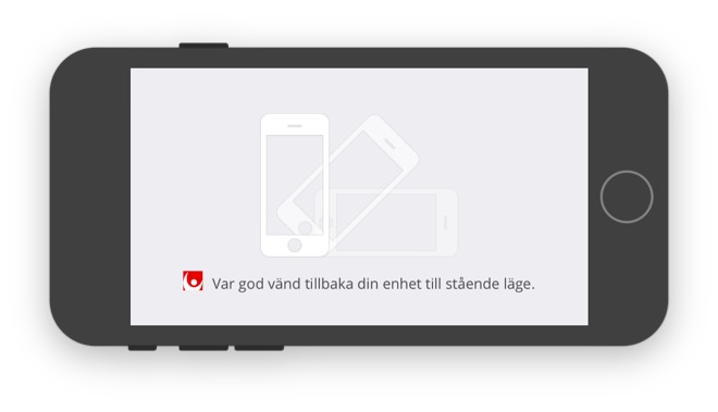
1.3.4 Orientation (AA)
This guideline states that you must not force users of mobile devices to hold their devices in or rotate them to a certain orientation in order to take part of a website’s content.
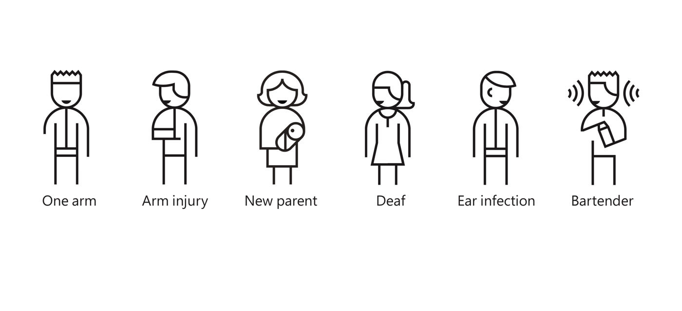
Following this guideline will improve accessibility for users who mount their tablets and smartphones to their wheelchairs or have trouble rotating them due to limited motor skills or because their hands are busy at the moment.
1.3.5 Identify input purpose (AA)
For following this guideline, the meaning of each input field must be able to be determined programatically. In other words, a piece of code must be able to tell what is expected to be entered by a user or what’s the meaning of a piece of entered information.
Doing this correctly will make it possible for a user’s browser to autofill input fields based on data previously entered by the user. Great! Having to enter less input is always nice.
Technically, this has to be true if:
- The implementation is done using technologies for identifying expected meaning of input data.
- The input field uses the Autofill markup like in the following code snippet
<form>
  <label for="input-email">Email adress</label>
  <input id="input-email" autocomplete="email" type="email">
  <label for="input-password">Password</label>
  <input id="input-password" autocomplete="current-password" type="password">
  <button name="button-sign-in">Sign in</button>
</form>
This guideline improves accessibility for users with cognitive disabilities who find it challenging to read and enter text. It’s also improves accessibility for users who don’t know the language of the website that well.
1.3.6 Identify purpose (AAA)
This guideline says that the purpose of interface components, icons and certain sections must be able to be identified programmatically.
For example: The user should not just understand that a button is a button. He or she should understand what the button does, what its purpose is.
HTML should always be written correctly, so that assistive technologies like screen readers can do things like:
- Identify sections like header, navigation, main content area and so on for easier navigation.
- Provide text alternatives to icons, which otherwise can sound weird when being read to users.
- Differentiate between different subheadings like H2, H3 and H3 subheadings for finding wanted content faster.
Following this guideline will improve accessibility for users of assistive technologies like screen readers.
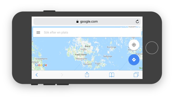
1.4.10 Reflow (AA)
This guideline states that users must be able to browse a website using a 320 pixel wide screen without having to scroll horizontally. In other words, your website must be responsive.
Why a width of 320 pixels? Probably because this is the smallest device width of a lot of popular smartphones.
Tip: Curious about what screen sizes are popular? Check out screensiz.es.
Following this guideline will improve accessibility for all users visiting your website on a smartphone. It will also benefit users with visual impairment who definitely will zoom in (up to 400 % ) on desktop browsers.
Note: It’s acceptable to allow horizontal scrolling for content that often requires it like maps, data tables with many columns and wide diagrams.
1.4.11 Non-text contrast (AA)
Having high contrast between pieces of text and their backgrounds is one of the best and most important things you can do to ensure great accessibility on your website.
In this guideline the requirement for high contrast extends from regular page text, to text on interface components (buttons) as well as for colors used in non-text content (infographics and diagrams).
Tip: For measuring contrast, I recommend Lea Verou’s excellent tool at leaverou.github.io/contrast-ratio.
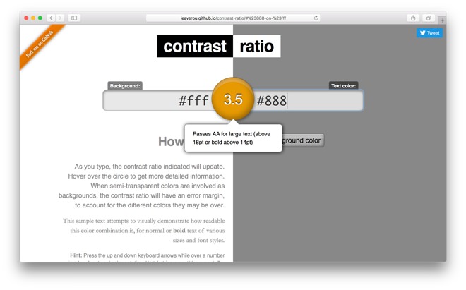
Following this guideline will improve accessibility for all users with different kinds of visual impairment.
1.4.12 Text spacing (AA)
For following this guideline, distances between paragraphs, rows, words and characters must be able to be increased to certain values without leading to loss of functionality or loss of content.
Failing at this could result in pieces of text overlapping, hence becoming unreadable. It could also result in components (links or buttons) being moved into places where they can’t be interacted with (outside the viewport or behind other elements).
Tip: Avoid setting fixed heights on elements containing text. When text needs more space, it has to be able to grow vertically and push down content below.
Following this guideline will improve accessibility for users with visual impairment and dyslexia.
1.4.13 Content on hover or focus (AA)
This guideline states that if users trigger content in the form of a modal window, tooltip or a similar component, they must be able to:
- Dismiss the content without moving the mouse cursor or the current keyboard focus (for example by pressing the Esc key).
- Scroll to the content (thereby moving the mouse cursor) without making the content disappear (when the cursor is moved).
- Dismiss the content solely on their own terms.
Following this guideline will improve accessibility for users with visual impairment. Especially for those users who are likely to zoom in when browsing a website and have to scroll to content that shows up outside of the viewport.
2.1.4 Character key shortcuts (A)
This guideline says that if a website supports keyboard shortcuts in the form of single characters like letters, symbols, numbers or punctuations one of the following three conditions must be met:
- The shortcuts can be turned off
- The shortcuts can be changed to also require pressing keyboard keys like Ctrl, Alt and Cmd
- A shortcut for a certain element is only active when that element has focus
Following this guideline will improve accessibility for people who use speech input for browsing a website. It will also improve accessibility for users who have hand tremors and easily press wrong keyboard keys.
2.2.6 Timeouts (AAA)
For following this guideline, users of your website must be informed if any period of inactivity could lead to loss of data. However, users don’t have to be informed of this if data is saved for more than 20 hours after their last interaction.
Following this guideline will improve accessibility for users with cognitive disabilities who need more time to complete wanted tasks.
2.3.3 Animation from interactions (AAA)
This guideline states that animations triggered by interaction must be able to be turned off unless the animations are essential for the functionality or the content being presented.

Following this guideline will improve accessibility for users who are susceptible to seizures due to motion.
2.5.1 Pointer gestures (A)
This guideline states that actions performed using complex gestures like pinch zooming and swiping must also be able to be performed using simpler gestures like single taps, double taps and long presses.
Remember: Even if users have great motor skills, the possibility to perform complex gestures might not be obvious to them.
Following this guideline will improve accessibility for users with limited motor skills or not enough fingers (!) for multi-touch gestures.
2.5.2 Pointer cancellation (A)
This guidelines says that when you interact with a screen by clicking, tapping and long pressing at least one of the following statements must be true:
- The triggered functionality doesn’t happen on the down-event.
- The functionality is triggered on the up-event and it’s possible to either cancel it before the up-event occurs or undo it afterwards.
- The up-event cancels what happened on the down-event.
- Triggering the functionality on the down-event has to occur for some important reason.
An example of point 2: If you’re using a mouse and press down on a button for deleting a file on Dropbox, you should be able to move the mouse cursor away from the button and release it and nothing should happen.
2.5.3 Label in name (A)
For succeeding with this guideline, text that is shown on interface components like buttons must be able to be:
- Read to users of assistive technologies like screen readers
- Triggered by voice commands by users who take advantage of speech recognition software
This is easy to succeed at if you use HTML elements like anchor tags and buttons correctly and write explanatory text labels.
Tip: If you replace text with an icon on an interface component, you can still make a screen reader read text to its user with the help of the aria-label attribute.
<button aria-label="Search">
  <span class="icon-search"></span>
</button>
Following this guideline will improve accessibility for people with visual impairment who use screen readers. It will also improve accessibility for users who use speech input for browsing a website.
2.5.4 Motion actuation (A)
For following this guideline, functionality that is triggered by moving one’s mobile device must also be able to be triggered by interacting with interface components like buttons and sliders.
Responses to (accidental) motion must also be able to be turned off, unless:
- The motion is supported through an accessible interface.
- The motion is essential for the functionality.
The shake to undo feature used on native iOS and Android apps could be very troublesome if you have hand tremors. Luckily, I haven’t seen it be used on any websites.
Following this guideline will improve accessibility for users who mount their tablets and smartphones to their wheelchairs or have trouble moving them due to limited motor skills or because their hands are busy at the moment.
2.5.5 Target size (AAA)
For succeeding with this guideline, a clickable element must have a height and width of at least 44 ⨯ 44 pixels. However, it can be smaller if:
- Its functionality can be achieved through another clickable element of 44 ⨯ 44 pixels.
- It’s located in a block of text, like a regular underlined link.
- Its size is determined by the device and browser the user is using (radio buttons, checkboxes).
- It must have this look and size in this particular context in order to make sense.
Following this guideline will improve accessibility for people who have hand tremors, large fingers and use mobile devices with touch input (especially with just one hand).
2.5.6 Concurrent input mechanisms (AAA)
This guideline states that you must never disallow users to use, switch between or add and remove different mechanism for input like mouse, keyboard, stylus, touch input or voice input. Even if it means ignoring the most common mechanism for interacting with a certain piece of content.
Following this guideline will improve accessibility for people with limited motor skills who prefer or must use a certain input mechanism even when it’s uncommon. For example: Using a keyboard or mouse when operating a tablet.
4.1.3 Status messages (AA)
For following this guideline, content that is updated dynamically must be notified to users of assistive technologies (like screen readers) without getting visual focus.
For example: You’re browsing a news website with a Twitter feed at the top of the site. It would be infuriating if every time a new tweet appears, you would automatically be scrolled back up to the top to see the new tweet.
A great way to solve this for users of screen readers is to use ARIA Live Regions. Here are three code snippets explaining how it works:
<div role="status" aria-live="off">
  When this text is updated,
  users with screen readers
  will not be notified at all.
</div>
<div role="status" aria-live="polite">
  When this text is updated,
  users with screen readers
  will be notified if they
  aren't doing anything else.
</div>
<div role="status" aria-live="assertive">
  When this text is updated,
  users with screen readers
  will be notified immediately
  regardless of what they're doing.
</div>
Following this guideline will improve accessibility for users with visual impairment, especially for those who use screen readers and are likely to zoom in on a website.
Wrapping up
Phew, that was the last of the new guidelines for WCAG 2.1. Is my post not updated or contains some mistakes? Please, let me know in the comment section and I’ll correct it.
Finally, remember that having great accessibility on your website will improve the user experience for all users.
/Alexander