
Mobile first website for a sleazy rock band
December 2014 – June 2015 (Part-Time)
Project Lead / UX Designer / Developer
In 2015, Swedish rock band Backyard Babies made a comeback after a five-year break. Their online presence had deteriorated and they needed a new website for marketing their new tour and studio album.
Quick summary
While I did most of the work, I was not alone. I worked alongside my friend and graphic designer Rickard Linder and the band members.
I was responsible for user research, wireframing, content, and development. Rickard did graphic design together with guitarist Dregen.
We worked mobile first so the website would have solid performance and look great regardless of screen size.
We launched the website in June 2015 after having worked on it on and off since December 2014. It had the following impact:
- Increased Google search visibility
- Got the band’s digital presence in shape
- Marketed the band’s new studio album and tour
- Gave journalists and event organizers what they needed
Note: I haven’t done any work on the website since 2015.
About the band
Backyard Babies is one of my favorite rock bands! When I was a teenager in the early 2000s, rock and metal were in a poor state. Limp Bizkit was climbing the charts, Axl Rose had gotten cornrows, and guitar solos seemed to be a thing of the past.
I was slowly losing faith in the future of rock ‘n’ roll until I one day turned on my parents’ TV to watch the Swedish music show Voxpop. There I saw the video for Backyard Babies’ new single Brand New Hate.
They. Blew. My. Mind.
Challenge: Replacing a broken website
For their 2015 comeback, Backyard Babies had signed a deal with my employer HiQ. They needed a digital partner for staying ahead in the tough and ever-changing music industry.
Their current website was completely broken and a new one was needed. Since Rickard and I had already made website for Dregen in 2013, we were a perfect for this gig.
Goals to achieve
Based on my deep love for both web design and loud rock music, I felt rock bands at this time usually had terrible websites with out-of-date content. Hence, I set out to make the best website for a rock band ever!
I also wanted to teach the guys in the band about the importance of keeping up their appearance online for SEO purposes. We set the following goals:
- Be easy to update with news
- Capture the band’s sleazy vibe
- Improve their Google Search listing
- Provide the right content for the right visitors
- Have great performance and work well on mobile devices
Learning what content users wanted first
With our goals set, we started by focusing on users and content before doing any visual design work and getting hung up on visual details.
After meetings with the band and their manager Per Kviman, we knew the website had to please:
- Journalists
- Casual rock fans
- Gig and festival organizers
- Die-hard Backyard Babies fans
Once identified, I reached out to these groups to learn what they wanted.
My prior coworkers at the Finnish newspaper Nya Åland were helpful. They often struggled to find good quality promo photos of band and artists. Insights like this were great!
For gig and festival organizers, Kviman and the band had great insights with their decades of common experience in the music business.
Struggling writing and finding content
After summarizing these insights, I wrote all content for the website. For feedback, I included a few rock music fans, a journalist at Nya Åland, and Kviman and the band members.
The press kit for the new album and tour proved to be very challenging to write. I wrote an initial tongue-in-cheek draft that the guys disliked. Kviman and the band then took over and cut me out.
The new draft was better and more condensed, but still not good enough. Later, I got to make some edits and it turned out fine. However, too much time was wasted.
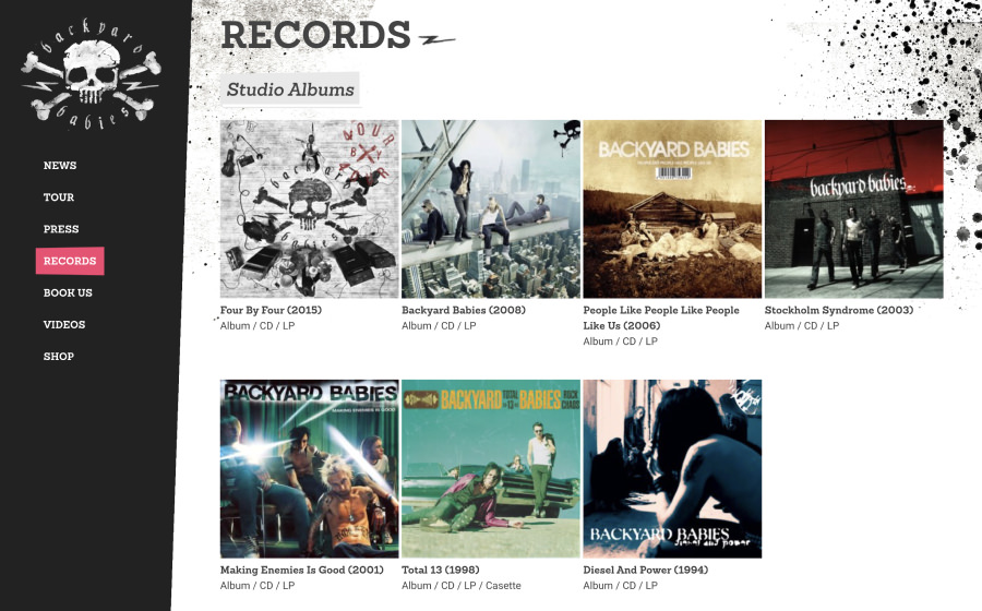
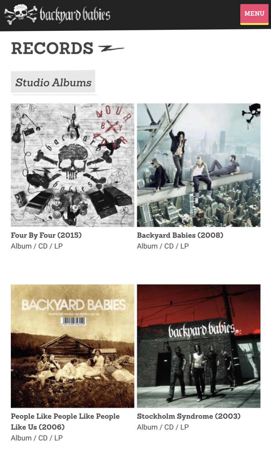
Trouble finding images of record covers
Finding images for the discography page was surprisingly difficult. We found a lot through Google and the Discogs community, but in good enough quality. Dregen helped by taking photos of his personal record collection. We even found some unknown promo singles we knew die-hard fans would love.
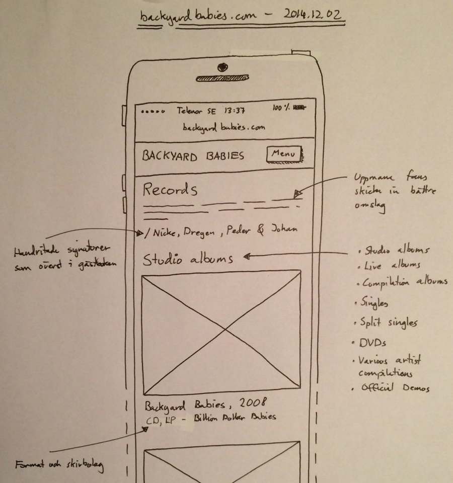
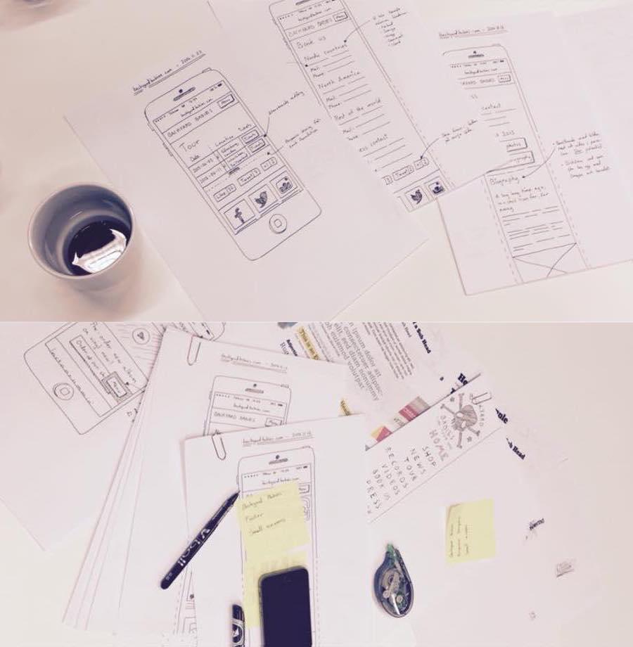
Wireframing on paper and designing in the browser to save time
With the content written, I started drawing wireframes of the website for both small and large screens. Everything in-between, I was going to design in the browser to save time.
Before presenting the wireframes to the band, I asked some designers at HiQ for feedback so I could fix likely usability issues.
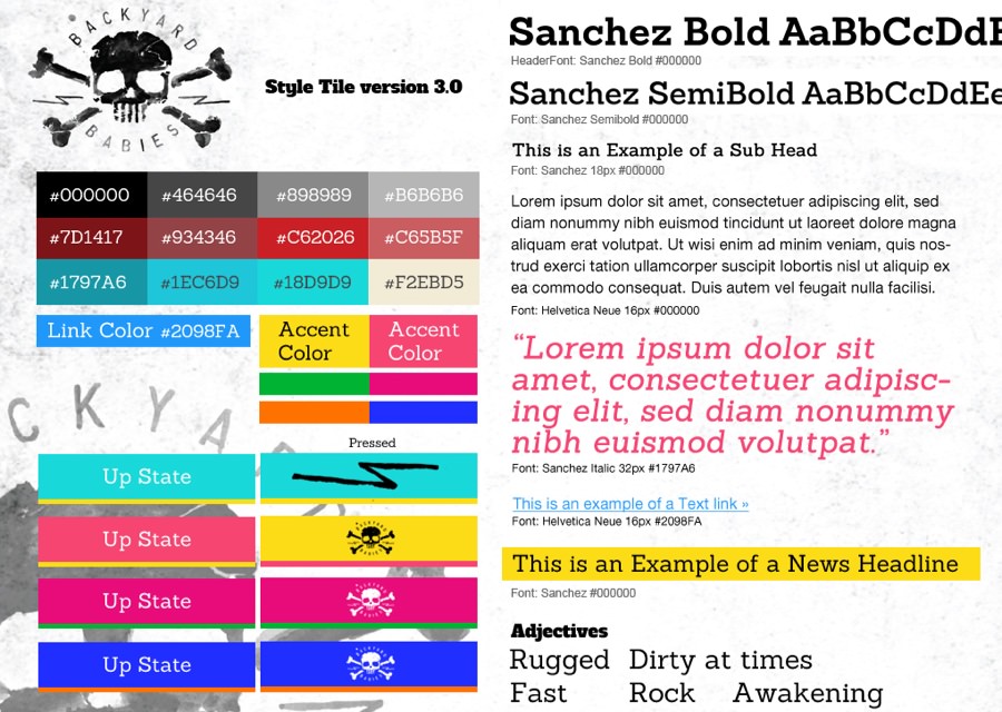
Making punk rock buttons with Dregen
For graphic design, Rickard and I worked closely with Dregen. Calling him the graphic designer of the band would be fitting.
He has drawn their logo and is heavilty invested in their visual appearance, album artwork, and promo photos. He has also done design work for his other band, The Hellacopters.
Throughout this phase, Dregen was involved in a lot of details. For example, he wanted the buttons on the website to have a punk rock vibe.
Dregen suggested using pink and yellow like the cover of the classic punk album “Never Mind the Bollocks, Here’s the Sex Pistols”.
Writing code and measuring performance
With content and graphic design done, it was time to start coding! At this time I had about three years of experience doing responsive web design and working mobile first.
I was fed up with slow-loading websites that weren’t designed for small screens and touch input.
While I did get help from coworkers at HiQ for browser testing, I did all development myself. For measuring performance, I used Google Pagespeed Insights and browsed the website on my phone on the Stockholm metro with poor 3G coverage.
Result and impact
When we released backyardbabies.com in June 2015, the band was about to start their European tour and release new material. Everyone was satisfied with the website, since we had met our goals:
- The band dug how it looked
- Google search visibility was increasing
- The band members could update it themselves
- It was fast and designed for both small and large screens
- Journalists and event organizers got the content they needed
How it made me feel
Working with both a great friend in Rickard and one of my favorite rock bands in Backyard Babies was exciting, educational, and so cool.
As a fan of Backyard Babies I had to pinch myself, since I was doubting it was actually happening.
Unfortunately, I couldn’t keep working with the band after switching employer later in 2015. The band and their manager Per Kviman wanted to keep me on board, but couldn’t do it for contractual reasons.
/Alexander
Tech stack details
We chose WordPress as platform due to it’s popularity and since Dregen already had experience using it. For saving time, I made a child theme of the official WordPress theme Twenty Twelve.
WordPress plugins used:
- Yoast SEO for optimizing SEO
- W3 Total Cache for optimizing performance
- Disqus Comment System for handling spam comments
Sass for writing CSS
For writing easily maintained CSS, I chose Sass. I skipped using any CSS framework like Bootstrap in order to keep the file size down.
Tools for compressing images
For optimizing performance, I compressed all images on the website using JPEGmini and TinyPNG. This hade a huge impact on performance together with W3 Total Cache.
Third-party Javascript libraries
I used the Javascript libraries Picturefill and Waypoints for implementing responsive images and triggering events when scrolling.