Making Facebook accessible for people with deaf-blindness and visual impairment
September 2013 – February 2014 (Full-Time)
UX Designer
From 2013 to 2014, I was in charge of design and aided development when the Swedish Post and Telecom Authority launched a website that made Facebook accessible for people with deaf-blindness.
Quick summary
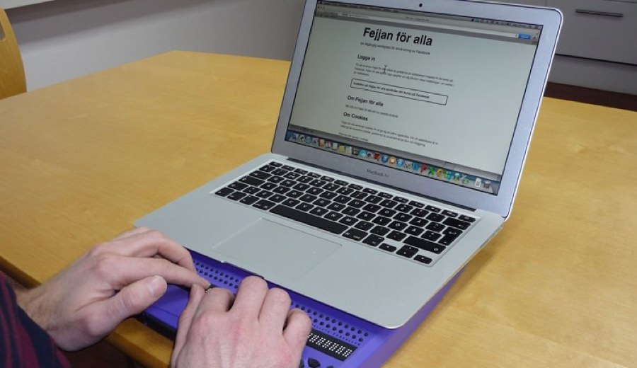
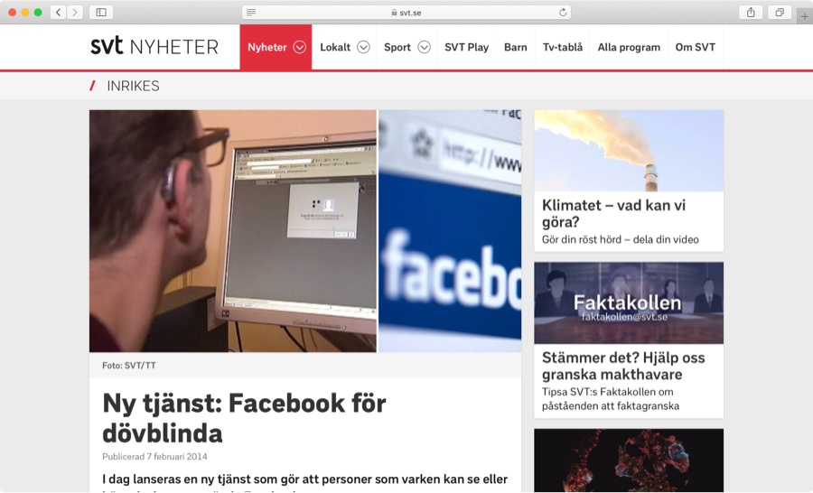
“Fejjan För Alla” was a website that made using Facebook accessible for people with deaf-blindness and visual impairment. It was a project by the Swedish Post and Telecom Authority (PTS) released in February 2014. It got national news coverage and praise from its users.
Users told us the website was the best way to use Facebook, by far! They could now do things they never could do before.
As the only designer in a small team, I met with users with visual impairment, hearing loss, and deaf-blindness. With their help I designed, developed, and usability tested an HTML prototype. This code was reused for the final website.
Note: The website was taken offline later in December 2015 due to Facebook API restrictions. Features weren’t possible to maintain.
PTS had learned Facebook wasn’t accessible
After extensive user research with the accessibility community in Sweden, PTS had learned that Facebook wasn’t accessible for people with visual impairment and deaf-blindness.
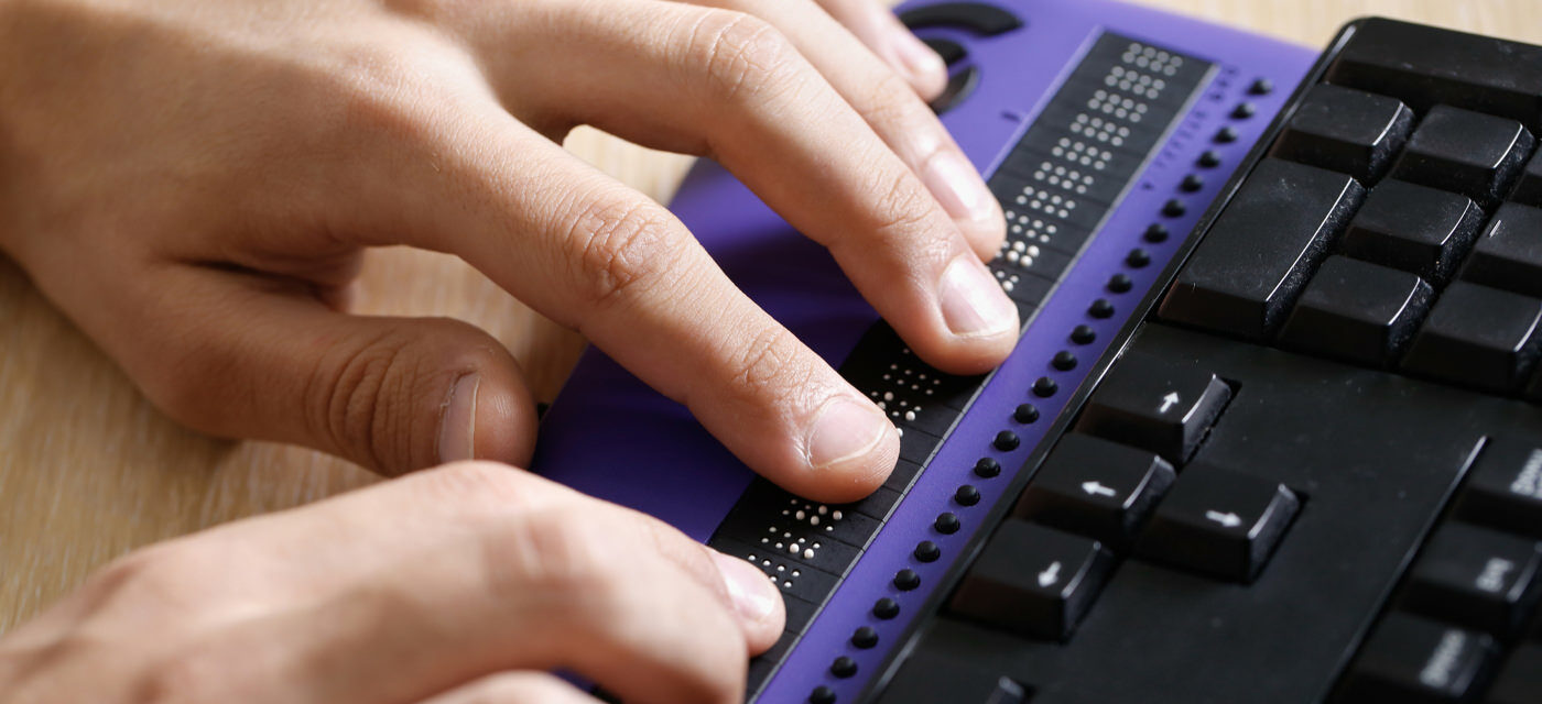
At this time, Facebook’s website and mobile apps didn’t work well with screen readers, Braille keyboards, and other assistive technologies.
Goal set by PTS
PTS decided to provide an accessible way to use Facebook for people with these disabilities. Their core belief was that visual impairment or deaf-blindness shouldn’t stop anyone from communicating with family, friends, and loved ones online.
Building a website was the only feasible option
Before the team and I could learn more about the users and their disabilities, we had to make a choice regarding technology.
For reaching as many users as possible, we decided to build a website instead of native apps for iOS and Android. Since the project had a tight budget, this was the only feasible option.
The website would use the Facebook API to replicate essential Facebook features. Since HTML works well with screen readers and Braille keyboards, we were confident.
Meeting users with deaf-blindness
Two years earlier, I had taken a course in website accessibility. However, no one else in our team had any experience in accessibility. We knew we had much to learn.
With help from the organization Förbundet Sveriges Dövblinda, we set up meetings with a user with deaf-blindness. The goal was to learn about the challenges of using Facebook and other websites using assistive technologies.
These meetings were incredibly educational and inspirational!
Making a prototype using HTML, CSS, and Javascript
To be able to perform usability tests with people using assistive technologies, I designed and developed a prototype using HTML, CSS, and Javascript.
Screen readers like Voiceover and JAWS read HTML well, but they can’t interpret prototypes done in apps like inVision or Axure RP that were popular design tools at this time.
I made sure to follow the Web Content Accessibility Guidelines and write realistic made-up content like:
- List of friends including their profile pages
- Friend requests and event invitations
- Profile posts with comments
- Different kinds of groups
- Message threads
- Private events
Writing this took more time than expected, but was essential for usability testing. Users had to feel like they were using Facebook, but through someone else’s account.

Continuously usability testing and improving the prototype
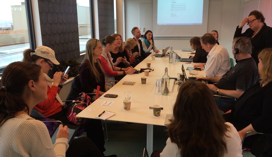
The entire team worked together when usability testing the prototype. Our project lead handled the time-consuming task of planning the sessions, while I put together the tasks for the users and ran the sessions.
Even the developers took notes during the sessions and assisted users when they needed help.

We invited four to five people with varying degrees of visual impairment and deaf-blindness to each session. During these sessions, they performed typical Facebook asks like:
- Writing posts
- RSVPing to events
- Commenting on posts
- Sending friends messages
- Searching for and joining groups
- Accepting and rejecting friend requests
We used feedback from each session to improve the web prototype for the next one, to which the users were invited back.
Users gave great constructive feedback! They were respectful, but didn’t hold back. If we had made a mistake, we got to hear it loud and clear.
It was humbling to learn how even the slightest adjustments to HTML markup and UX Copy could solve or break the accessibility of a certain part of the design. We had to be thorough and avoid basic mistakes to not waste time.
I learned that great accessibility takes a lot of time to get right and almost no time to screw up.
In total, we held four group testing sessions. I also made two home visits to one participant for additional testing. Two other participants did more testing on their own by answering detailed questions over email.
Final testing of the final website with real content
Once the team and I were satisfied with the prototype, we started building the final website reusing must of the code from the prototype.
With real Facebook content in place, we set up one more usability testing session with these participants before releasing “Fejjan För Alla”. The session went very well!
Struggling with the Facebook API
The Facebook API wasn't meant for building Facebook outside of Facebook. As expected, this became a huge struggle. For some must-have features we had to get creative. For example, the API allowed us to retrieve unread messages, but not mark them as read. Hence, we just listed the latest active message threads in descending order. It wasn't perfect, but it tested well.
Result and impact
We released “Fejjan För Alla” in February 2014. Based on the feedback, Facebook was now probably easier to use for several hundred thousand people in Sweden with visual impairments.
Users told us “Fejjan För Alla” was the easiest way to use Facebook by far! A lot of them could now do things online they never could do before.

Note: The website was taken offline later in December 2015 due to Facebook API restrictions. Features weren’t possible to maintain.
How it made me feel
Even though I was familiar with website accessibility, working with people with different degrees of visual impairment and hearing loss had a profound effect on me.
I realized what a huge effect good and bad digital design can have on someone’s everyday life.
“Fejjan För Alla” was the most humbling project I’ve ever been a part of. Since then, great accessibility is always a top priority for me when taking on new design work. It also made me start giving talks on this topic.
/Alexander