
Design system and business-critical digital products for a national health company
Since 2017, I’ve been strengthening and expanding the digital product suite for Swedish corporate health provider Feelgood. I’m working across two cross-functional teams designing products empowering both staff and clients.
About Feelgood
Feelgood is Sweden’s leading corporate health provider. They offer a wide range of health services for private individuals, organizations, and businesses across both the private and public sector.
Founded in 1995, the company now has more than 800 employees and operates at 140 locations nationwide. Since 2021, Feelgood has been owned by Terveystalo, Finland’s largest healthcare provider.
Today, Feelgood serves over 8,000 client companies representing roughly one million employees.
Summary
My focus has been on these four products.

Feelgood Web Portal
Managers at client companies were previously using separate web apps to manage orders, bookings, complaints, and invoice data. These apps had inconsistent UI design, weak branding, and a poor user experience. This new web app released in 2017 solved these issues.
- Gathered all features in one place
- Significantly improved accessibility
- Reduced daily workload for internal staff
- Played a key role in winning new business
- Saved managers time in their everyday work
- Greatly improved usability on mobile devices
More about Feelgood Web Portal …

Feelgood Visitor Registration
Most of Feelgood’s 55 health clinics don’t have staff assisting visitors with appointment registration. This used to cause missed appointments, confusion, and stress for both visitors and staff on a weekly basis. This web app released in 2018 significantly mitigated these pain points.
- Enabled visitors to self-register
- Saved time for staff on a daily basis
- Reduced weekly misunderstandings
More about Feelgood Visitor Registration …
Feelgood Design System
To ensure a great and accessible user experience across Feelgood’s digital products, we began designing and using a design system in 2019. It’s available as a Figma library and at design.feelgood.se. We call it Feelgood Design System, or simply FDS.
- Higher codebase quality
- Simplified daily design work
- Significantly improved accessibility
- More time-efficient software development
More about Feelgood Design System …

Feelgood App
This mobile app (iOS and Android) released in 2019 has truly empowered employees at client companies. They can now manage bookings, report absence, update vaccination history, submit sick notes, fill out health surveys, and get health tips.
- Provided a new platform for marketing
- Played a key role in winning new business
- Reduced workload for managers at client companies
- Enabled employees to handle their personal healthcare
Note: I have not yet written a case study on this app.
Feelgood Web Portal
Here’s a detailed look on how we made everyday work easier and more time-efficient for both internal staff and managers at client companies.
In 2017, managers at Feelgood’s client companies were using separate web apps to manage orders, bookings, complaints, invoice data, and more.
Unfortunately, these web apps had inconsistent UI design, weak branding, and a poor user experience – especially on mobile devices.
Feelgood recognized that merging and improving these web apps was essential to keep existing clients happy, reduce every workload for internal staff, and win new business.
To do this, CTO Paul Cohen put together a cross-functional team that I joined as Product Designer.


Goals
With the must-have featured already identified, setting goals was a breeze. We planned to measure them through usability testing, analytics, and follow-ups with internal staff and managers at client companies.
- Improve the usability of every single feature
- Align the portal with Feelgood’s graphic profile
- Minimize data entry by users whenever possible
- Save time for staff managing orders and bookings
- Reduce support calls about these orders and bookings
- Significantly improve user experience on mobile devices
Learning about users through listening to support calls
Right away we scheduled listening sessions with Feelgood’s support staff. We had to understand the issues managers at client companies were facing firsthand.
We also made sure to met with staff handling orders, bookings, and complaints. We needed to learn what information they needed and which of it managers at client companies had to supply.
Speeding up decision-making through paper sketching
Using insights from this research, I started sketching to quickly elicit additional requirements, get answers to complex questions, and speed up decision-making among stakeholders.
Since improving the user experience on mobile devices was a goal, I worked mobile-first and started sketching for small screens. Over the following two months, I met with stakeholders several times per week to discuss and refine these sketches.
This approach worked well. Developers gradually understood what tu build, while stakeholders were pushed to make high-level decisions.
Paper sketching is fun, fast, inclusive, and keeps the focus on content and functionality.

Creating a clickable prototype for usability testing
After having focused on small screens in my paper sketches, I designed a clickable prototype for large screens. It saved us time by serving multiple purposes:
- Explaining interaction design to developers
- Keeping other stakeholders up to date
- Conducting usability tests with clients

Usability testing revealed confusing healthcare terminology
A colleague at Feelgood’s marketing department and I conducted interviews with managers at various client companies, both in and outside of Stockholm.
We asked about using the current web apps, but focused on observing them perform tasks using the prototype. When they ran into issues or had questions, we discussed them in detail.
All participants completed all tasks with barely any assistance. However, many found Feelgood’s healthcare terminology too confusing.
Afterwards, we spent a good chunk if time simplifying the terminology using layman’s terms.
Expanding limited print guidelines
While usability testing, I also worked on graphic design for the web portal. This was challenging because Feelgood only had graphic guidelines for print design at this time.
I added new colors to improve contrast and a new typeface that rendered characters more clearly.
Our frontend developer Adam Heidmark and I then started designing components. We started using Sketch but quickly moved on to HTML, CSS, and JavaScript.
We needed to show how typefaces, colors, and components would be rendered and work across different web browsers, operating systems, and screen types.

Designing in the browser to save time
Adam began writing code while I still was running the usability tests. Once I was done, I supported him by clarifying interaction design and testing our work in different web browsers.
At the same time, I was refining the visual design. We made most design decisions in the browser, which helped us avoid time-consuming back-and-forth in Sketch.
I also verified accessibility by testing with VoiceOver and navigating the interface using only a keyboard.
Release and impact
The Feelgood Web Portal was released in November 2017. Managers at client companies felt it had a professional vibe was easy to use. They really appreciated having all features in a single web app.
After a few months Feelgood’s support staff noted a welcome decrease in calls regarding healthcare orders and bookings. This was one of our goals!
That we complyed with WCAG paid off (and continues to pay off), since potential new client companies often inquiry about it or specifically request it for signing contracts.
Former Feelgood CEO Joachim Morath has repeatedly stated that the portal has played a key role in winning new business.

“I must say that the new portal feels great! It’s really user-friendly.”
– User in an email in 2017
“Now that your account manager has presented the portal, I can simply say one thing – amazing!”
– Client to the marketing department
Overall, it looks great and seems to work really well! Intuitive to both use and understand.
– Potential new client in 2024
“Feelgood Web Portal is much easier and tidier and not as difficult. You’ll avoid so much clicking and choice-making”
– Client comparing a competitor’s portal to Feelgood’s
Fixing usability issues after release
Despite the strong initial feedback, several usability issues needed attention.
Missing contact information led to missed appointments
Client companies regularly supply Feelgood with personnel files to make it smoother for their managers to place healthcare orders for their employees.
I had assumed these files were complete, which often wasn’t the case. Hence, there was no way to add missing phone numbers or email addresses for employees.
This led to complaints about employees missing appointments they hadn’t been notified about. We solved this by simply adding input fields for entering missing contact information.
Frustrating to find replies to specific orders
After placing an order, users can send follow-up questions on its unique page. Since replies from Feelgood are important and time-sensitive, we send users an email for each new reply.
By mistake, the email template didn’t include a link to the order page. This forced users to dig through their order history to find the order with the new reply. Incredibly frustrating!
Quickly, we solved this by adding the missing link. However, we also started highlighting orders with new replies directly in the portal. Now, users didn’t have to check their inboxes.
Adding requested features
Since its release, we’ve been continuously updating Feelgood Web Portal with requested features.
Sign in using BankID
From both a business and security perspective, support for BankID was essential. Many client companies require it.
English language support
Many client companies have a sizable amount of English-speaking employees. Hence, adding English language support was great for both accessibility and business reasons .
Manage invoice data
This feature was planned for the initial release, but was delayed due to backend limitations. It was finally implemented a few months later.
Secure email
Sending encrypted and sensitive information was previously only available as a separate web app due to backend limitations. Now, it’s another great addition in the portal.

Feelgood Design System update
In 2021, we implemented the Feelgood Design System. No the portal has the same look and feel as the Feelgood App and Feelgood Visitor Registration. Aside from a few performance issues, support staff reported no complaints upon the update.

Feelgood Visitor Registration
A detailed look on how we reduced missed appointments, confusion, and stress during visitor registration at Feelgood’s health clinics.
While Feelgood operates at 140 locations in Sweden, only 55 of these health clinics are branded as Feelgood’s own. Most of these 55 clinics lack staff that assist visitors with appointment registration.
This caused missed appointments, confusion, and stress for both visitors and staff on a weekly basis.
Goals
Two goals were clear from the start: visitors must be able to self-register, and staff must be notified automatically. After further discussions, we added these goals:
- The solution must easily scale nationwide
- Visitors must be able to get help if technical issues arise
- Registration should only require your personal identity number
Learning about issues by interviewing staff
Right away we set up interviews with staff at clinics that didn’t have receptionists. We needed to hear about the issues both visitors and staff had been facing.
We learned that visitors had to be informed if they were:
- So late that they would need to reschedule
- Several days, weeks, or even months early
- Slightly late, but not forcing cancellation
- On time, but at the wrong clinic
For these interviews, I was joined by our new frontend developer Andreas Reinholdsson. I absolutely love when developers take time to meet users like Andreas did.

Handling privacy concerns among staff
All clinics use the same journal system, which includes a notification feature – but it couldn’t be triggered by an external solution. This made things a bit more difficult.
This meant we needed to send staff notifications using SMS or email. Unfortunately, they were hesitant about using both. This made things even more difficult.
They rejected email because they didn’t want to keep email clients open for privacy reasons. They rejected SMS because they didn’t want to carry both their work and personal phones all day.
We chose email. Phones can be misplaced, but clinics always have computers available.
To address the privacy concerns, we ensured that email subject lines would never contain personal information – only that a visitor with an appointment at a specific time had arrived.
Staff were still somewhat hesitant, but agreed to give it a try. Great!
Why we built a web app instead of a mobile app
The solution would run on a tablet placed in each clinic lobby. We decided to build a web app instead of a native app because we then could:
- Avoid Apple and Google’s review requirements
- Ship updates faster thanks to no review process
- Use any tablet regardless of its operating system
How the registration works using the web app:
- The visitor enters their personal identity number
- The journal system is queried for appointments
- The visitor is informed if the appointment is found
- The staff is sent an email that the visitor has arrived
If a visitor is too late, they are asked to book a new appointment. If registration fails due to a technical issue, a phone number is displayed.

Usability testing in production for best possible feedback
After our meetings with clinic staff, I designed a high-fidelity prototype. I skipped paper sketches since I felt the interface was simple enough.
For usability testing, we did a limited release of the actual web app at a clinic in Stockholm. This let us observe how it worked for both visitors and staff in real conditions.
Testing a prototype would only have given us feedback on the interface, but not on the full solution.

Great feedback and fixable issues
It took two days to set up the tablet and instruct staff on how the everything worked. After two months, they got back to us with feedback.
What was great:
- It worked well for both visitors and staff
- Staff liked not having to ask visitors for ID
- There were no technical issues with the tablet
- It was easily managed thanks to our instructions
What needed to be fixed:
- Appointments created in the journal system just before their time slots were sometimes not found
- Visitors didn’t understand they had to enter the full year in their personal identity numbers
- Registrations failed if staff members didn’t have an email address in the journal system
- Some staff members missed emails due to settings in their email clients
- When the tablet screen got dirty, it became a bit hard to read
- Some visitors had trouble reading the text

How we fixed the issues
Even though there were quite a few issues, we sorted them out fast.
Supporting multiple formats for personal identity numbers
Despite asking for the format YYYYMMDDNNNN, visitors still entered the shorter format YYMMDDNNNN. We just added support for this format too.
Importing appointment data more frequently
Developers fixed the issue with recently created appointments not being found by importing data from the journal system much more frequently.
Better instructions for email notification
We updated the setup guide with clearer instructions. We also mentioned that staff should clean the tablet screen regularly.
Making all text larger
Some visitors struggled to read text, even though nothing was smaller than 16 pixels. We increased its size as much as possible without breaking the layout.
Putting up posters for attention
When visiting another clinic that tested our solutions, we noticed some visitors didn’t see the tablet – they just sat down and waited. I still remember the horror!
Soon afterwards, we set up posters next to the tablets telling users to register here. It was a simple oversight, but exactly the kind usability testing is meant to catch.


Release and impact
Feelgood Visitor Registration was released in summer 2018. Today, it’s used at more than 35 of Feelgood’s 55 health clinics and has had a significant impact.
- Enabled visitors to self-register
- Saved time for staff on a daily basis
- Reduced weekly misunderstandings
Feelgood Design System update
In 2021, we implemented the Feelgood Design System so the Feelgood Visitor Registration would share the same look and feel as the Feelgood App and Feelgood Web Portal. We notified clinics about the update months in advance. They reported no issues.
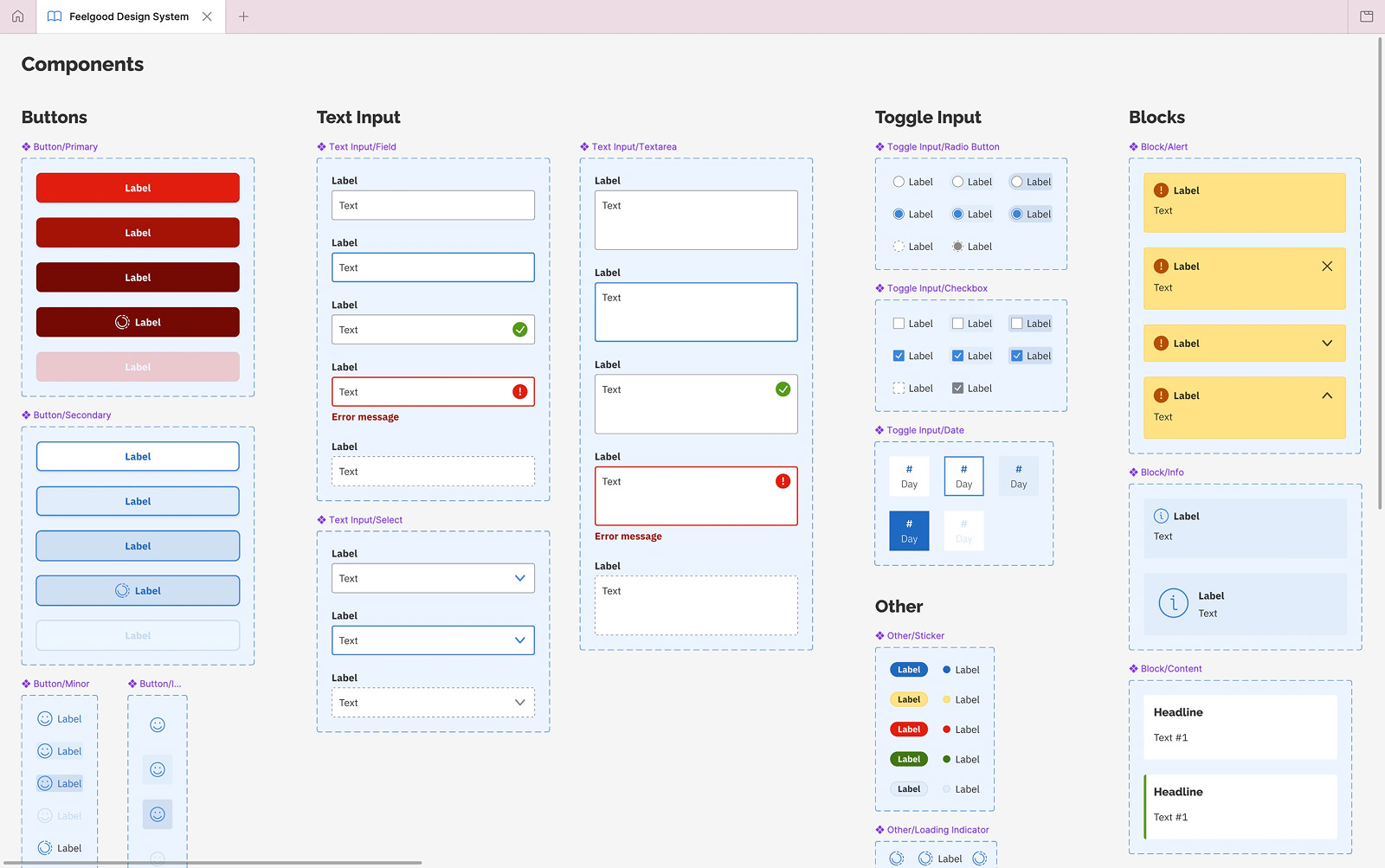
Feelgood Design System
A detailed look on how we ensure a great and accessible user experience across Feelgood’s digital products.
Design systems have been a hot topic for years in the design community. Many designers agree they’re challenging to build – and even harder to roll out and especially maintain.
To ensure a great and accessible user experience across Feelgood’s digital products, we began designing and using a design system in autumn 2019. We call it the Feelgood Design System, or simply FDS.
Goals
Based on Feelgood’s expectations and needs, discussions with colleagues, and best practices, we decided that FDS should:
- Serve as a guide for designers, developers, and marketing staff
- Initially focus on the needs of frontend developers
- Comply with the latest version of WCAG
- Focus on just what our products require
- Continuously be improved over time
- Be easily accessed as a website
Higher-ups agreed with my idea
After releasing the Feelgood Web Portal and Feelgood Visitor Registration, the next project was the Feelgood App. Higher-ups at the company felt a new digital graphic profile was needed for this.
I argued that we should also start building a design system to align with this work. After one or two weeks, all stakeholders had agreed and expanded our budget. Nice!
With Feelgood’s growing product suite, not having a single codebase would have been inefficient.
Support from a senior graphic designer
Creating the new graphic profile was more than I could manage on my own while only working part-time, so I asked for support – and got it!
Luckily, my colleague and senior graphic designer Johan Kuno was available. He joined the team for a few months and immediately began working on icons, colors, typography, logotypes, and imagery.
We worked in Sketch and shared drafts via Zeplin. Kuno led the work on the new graphic profile, while I reviewed his work, gave feedback, and assisted him.
Regarding accessibility, I made sure our work complied with the guidelines in WCAG 2.2 (AA).
I really enjoyed our detailed discussions, which ranged from overall look and feel to the smallest visual details. We had lots of fun and some heated discussions.
Choosing an established icon library
Kuno and I reviewed several established icon libraries before going with Streamline. This library offered a vast collection of well-categorized icons in different variants. Its search function was also excellent.
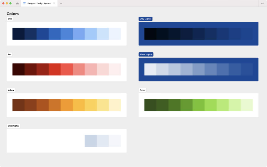
Expanding the color palette twice
For colors, we stayed close to Feelgood’s existing palette of blue, red, and white. We did make some adjustments to improve their appearance on screens.
However, we added lots of shades of these colors for designing components. In hindsight, even more shades would have been helpful. By early 2024, I was finally expand the palette further.


Switching typeface to improve accessibility
Kuno and I were slow to notice that our initial choice of Open Sans for body text rendered characters like I, l, and 1 too similarly.
This wasn’t just a general accessibility concern – it would definitely had caused problems for users handling invoice references and other IDs with random letters and numbers.
After convincing the marketing department that had already started using Open Sans, we switched to IBM Plex Sans and solved this mishap.
Only designing the components we needed
With Kuno’s limited time, we focused on designing components exclusively for the Feelgood App. I would add more for our other digital products later.
Although it was tempting to just churn out components, I had been advised against this by experts Dan Mall and Brad Frost during the conference An Event Apart in Boston in 2019.

Publishing the design system on a website
Early on, we had decided to publish FDS on a website due to the following reasons:
- Easy access – You shouldn’t need Figma to copy a HEX code.
- Realism – Different web browsers render elements differently.
- Interaction – Easy to test them using mouse, keyboard, and touch.
- Efficiency – We could usethe same tech stack as our other products.


Setting up a plan for regular feedback
With limited time on our hands, the team and I decided to ship a first version containing only basic design tokens like:
- Icons
- Colors
- Spacing
- Typography
- Logotype variants
In between updates, we planned to gather feedback by sharing the website with other designers and developers.
First round of feedback
After sharing the first version of the website with five designers, we learned that:
- The website felt tidy and looked great
- Some download links were easy to miss
- Logotype variants needed usage guidelines
- It felt catered to developers (but not too much)
- Colors looked great but also needed guidelines
- The homepage should provide clearer guidance
- Spacing was well presented (but needed examples)
- Typography was well presented (like the Google Fonts links)
Every designer we shared the website with also asked us to add components.
Pandemic postponement and Figma migration
In February 2020, we were about to add components to the website, but the COVID-19 pandemic led to business reprioritization at feelgood. Fortunately, I got time to migrate to Figma.
In November 2022, we finally added the components and made tweaks to existing design tokens. This was much needed update.
In 2023, we mainly focused on our other products. However, I still made big updates to the Figma library by specifying variables and adding component properties.
In 2024, we made another major update to the website by switching from Stencil to Storybook to better manage and present our components.
In 2025, we mainly curated the Figma library apart from updating the website with the expanded color palettes.
In 2026, the plan is to get going with vibe coding for prototyping purposes. Our Figma library is already set up for it thanks to proper use of features such as variables and Auto Layout.

Release and impact
The first version of the Feelgood Design System was released in 2019. Today, it is used across the Feelgood App, Feelgood Visitor Registration, and Feelgood Web Portal with more solutions to come. Its impact has been substantial!
- Increased codebase quality
- Simplified everyday design work
- Significantly improved accessibility
- More time-efficient software development
As a designer, having everything lined up in Figma is a huge time-saver on a daily basis.
How working at Feelgood has made me feel
Working at Feelgood has been both the most challenging yet the most rewarding client gig I’ve ever had. It’s impossible to sum up in a couple of paragraphs, but I’ll try.
Playing a part in helping people improve their health and well-being is the main reason I’ve stayed with Feelgood since 2017.
Another reason is my helpful, kind, fun, and geeky team members. When my assignment ends sometime in 2026, I’ll truly miss them – especially beating them on table tennis.

/Alexander