
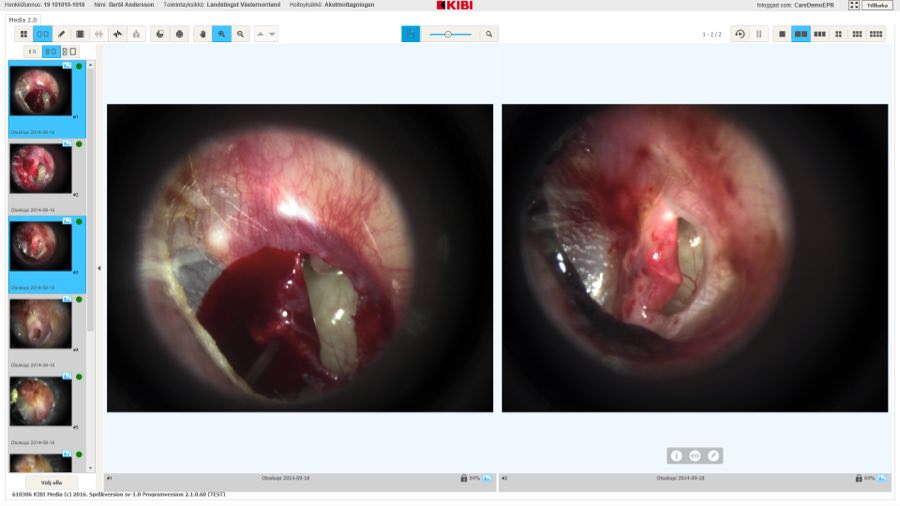
Widely used web app for hospital staff for managing documents and images
Timeline: March 2013 – August 2013
Allocation: Part-Time
Role: UX Designer
In 2013 I helped medtech company KIBI (acquired by Omda in 2019) design a web app for hospital staff used for handling and editing documents and images. It’s used in county councils all over Sweden.
Quick summary
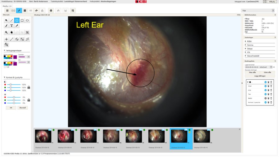
KIBI Media is a multimedia management app used by hospital staff. Its goal is to make it easy and efficient to organize, edit, and compare photos and video of a patient’s medical condition and its progress over time. It is the result of two previous web apps merged into one.
A team of two designers
My friend and graphic designer Rickard Linder and I worked together on this assignment. We benchmarked photo editing apps, met with a hospital photographer, and assisted the developers at KIBI. I specifically made and usability tested a low-fidelity prototype of the app, while Rickard was in charge of graphic design.
Still a success after four years
Four years after the project ended, I reached out to KIBI and asked how everything was going with KIBI Media. I was told it had been a great success and was still being used in county councils all over Sweden.
“KIBI Media is the best app out there and is incredibly easy to use”
– Swedish chief physician on KIBI Media
About KIBI
KIBI was a Swedish software development company focusing on medical documentation and diagnostics solutions for healthcare providers. Their e-health solutions were used at over 100 hospitals and care centers in northern Europe.
In 2019, KIBI were acquired by Omda.
Goals to achieve
For merging their two web apps into one, KIBI had set these goals:
- Improve usability of existing features
- Add new sought-after features with great usability
- Take the visual design of the new app to the next level
Bechmarking photo editing apps
Immediately, Rickard and I started analyzing current popular photo editing apps on the market. After benchmarking, we made educated guesses on must-have features with valuable input from KIBI.
We then drew whiteboard sketches of the new app and discussed early ideas for graphic design. This would come in handy later.
Spending a day with a hospital photographer
For learning more about our users, Rickard and I flew to a hospital in northern Sweden where we spent a full day with their photographer. We interviewed him and observed him doing everyday tasks.
We were surprised to see how many different pieces of software the photographer was using throughout his day
It was obvious a lot of time could be saved if KIBI’s new app could offer the same features as his current software stack.
Wireframing the entire app
With our benchmarking done and our insights from our day with the photographer summarized, we got to work!
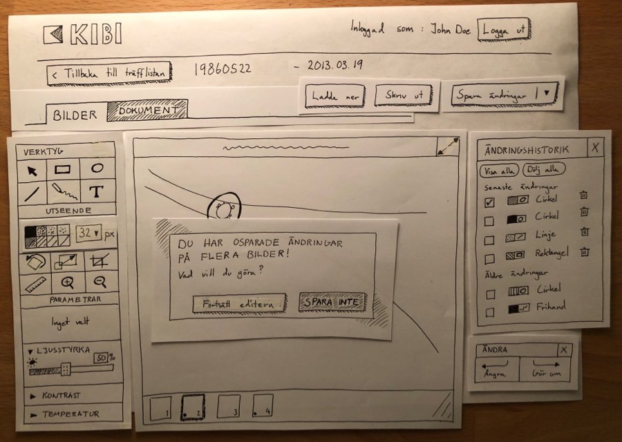
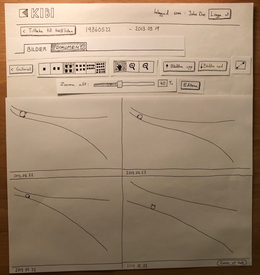
I started drawing wireframes of the entire app, including even the smallest features. For saving time I drew everything on paper, which Rickard would later turn into high-fidelity sketches. The wireframes I drew showed how to do things like:
- Import photos from your computer
- Compare different versions of these photos
- Adjust color and contrast of photos
- Draw overlays on photos
Usability testing the wireframes
For usability testing these wireframes, I got in touch with five coworkers at HiQ that were interested in photo editing. Some were eager beginners, others were total photography geeks. I had them perform tasks on an elaborate low-fidelity prototype based on my wireframes.
After summarizing these sessions, I knew Rickard and I had nailed most of the design right away. We only had to adjust minor details. Our benchmarking and time with the photographer had paid off!
Graphic design and working with developers
Once I had improved the wireframes based on the feedback, Rickard started working on graphic design. He kept me in the loop, listened to feedback, and included several of my ideas.
When we felt content with his high-fidelity sketches and graphic design guidelines, we presented it to the developers at KIBI. Throughout the rest of the project, we regularly met with them and helped them implement our design.
KIBI’s developers told us that it was great to work with designers who actually knew some programming
Getting rid of precious pixels
Since KIBI Media would run in a web browser and many users were still using small monitors, we had to trim as many pixels as possible. We spent lots of time reducing padding, margins, and writing shorter UX Copy without trying to hurt usability. It was just as fun as frustrating.
Result and impact
Four years after the project ended, I reached out to our project lead at KIBI and asked how everything was going with KIBI Media.
I was told it had been a great success and that the app was still being used in county councils all over Sweden. The project lead even shared a fantastic quote from a chief physician he had spoken to.
“KIBI Media is the best app out there and is incredibly easy to use”.
– Swedish chief physician on KIBI Media
How it made me feel
On a daily basis, hospital staff are dealing with large amounts of stress. Unfortunately, they also often have to deal with software with poor usability. However, if this software is well-designed it can save a significant amount of time and energy each day.
Hence, I take great pride in this kind of design work. In this project, we definitely made a big positive difference. That still feels fantastic!