Design system and digital solutions for major national healthcare company
Timeline: Since April 2017
Allocation: Part-Time
Role: UX / UI Designer
Since 2017, I’ve been helping Swedish national healthcare company Feelgood expand and improve their digital solutions by making sure they offer a great user experience and follow WCAG 2.2 (AA).
About Feelgood
Feelgood was founded in 1995 and has over 1,000 employees and 155 health clinics throughout Sweden. 56 of them are branded as their own. Since 2021 it’s owned by Terveystalo, Finland’s biggest healthcare service company.
Feelgood offers a wide range of health services for private individuals, organizations, and businesses in the Swedish private and public sectors.
Feelgood has over 8,000 companies and organizations as clients in Sweden, with a combined total of about 1,200,000 employees.
Quick summary
While I’ve done design work on several solutions, these are the ones that have had my main focus.
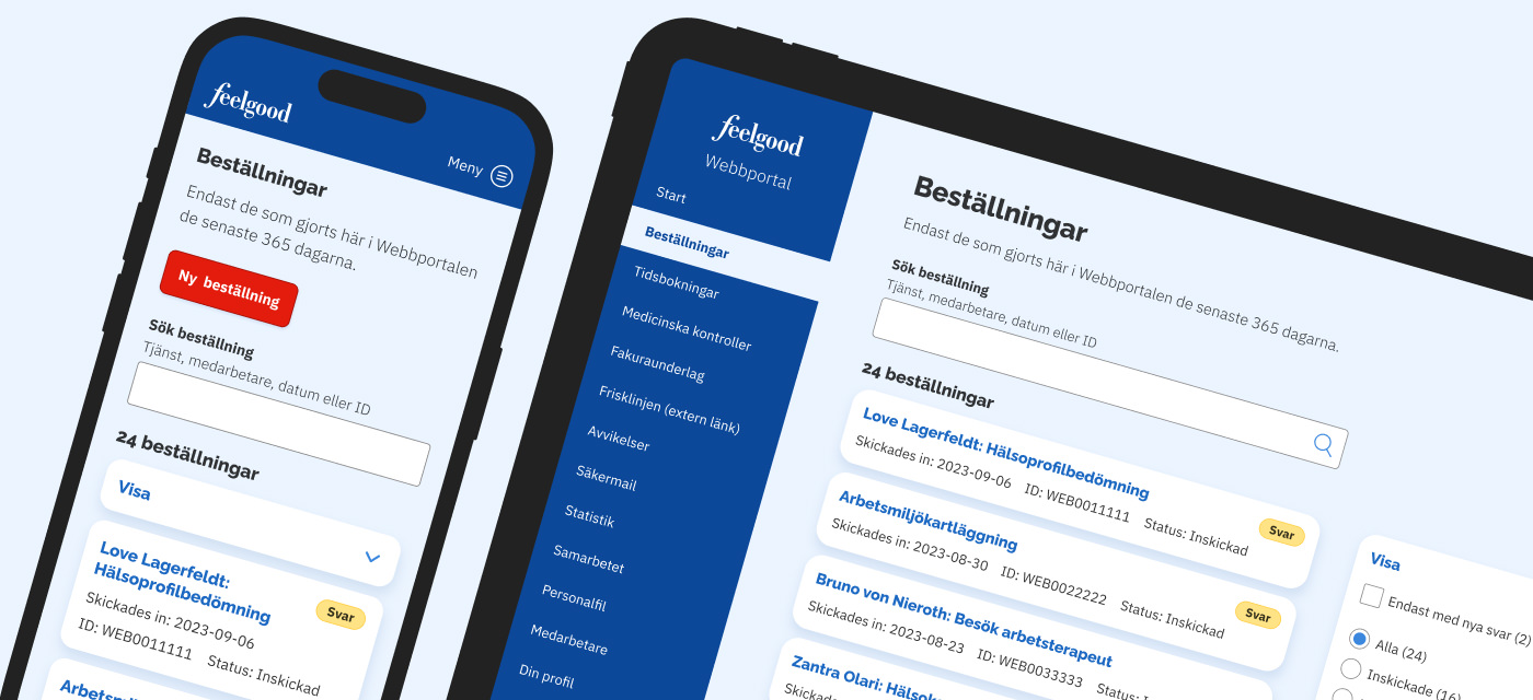
Feelgood Web Portal
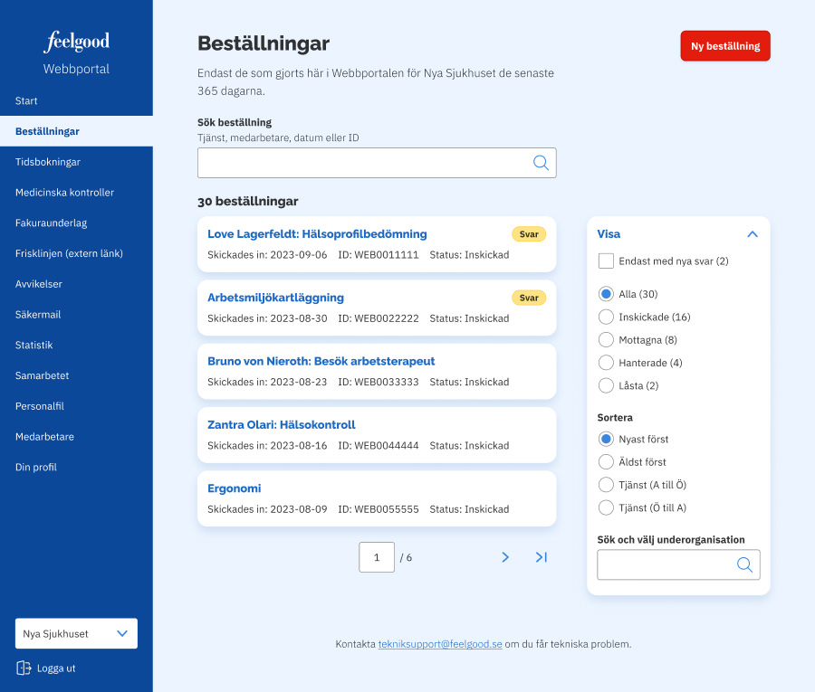
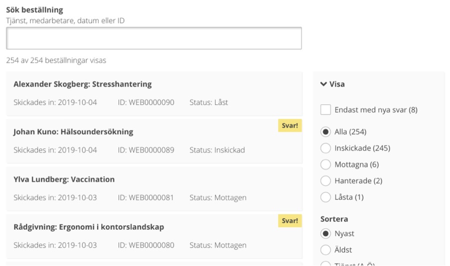
Managers and HR staff at Feelgood’s clients were initially using different web apps for managing orders, bookings, complaints, and invoice data. All of these web apps had inconsistent design and poor user experience, especially on mobile devices. Now, everything’s easier and done using the Feelgood Web Portal. It was released in the Autumn of 2017.
The Feelgood Web Portal has:
- Gotten great feedback from its users
- Been essential for securing new client contracts
- Made it possible to perform tasks on mobile devices
- Helped managers at clients handle more tasks on their own
- Saved time for both clients and Feelgood staff on a daily basis
Feelgood Visitor Registration
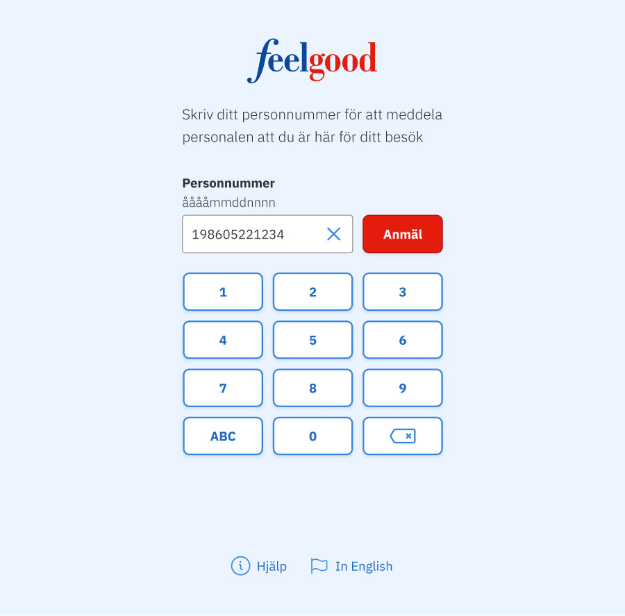
Most of Feelgood’s clinics don’t have any staff for welcoming visitors and registering them for their appointments. Thanks to the Feelgood Visitor Registration, visitors can now register for their appointments by simply entering their personal identity numbers on tablet in each clinic lobby. It was first released in the Summer of 2018.
The Feelgood Visitor Registration has:
- Helped clear up more misunderstandings
- Saved time for treatment staff at clinics on a daily basis
- Made it possible for visitors to register for appointments
Feelgood Design System
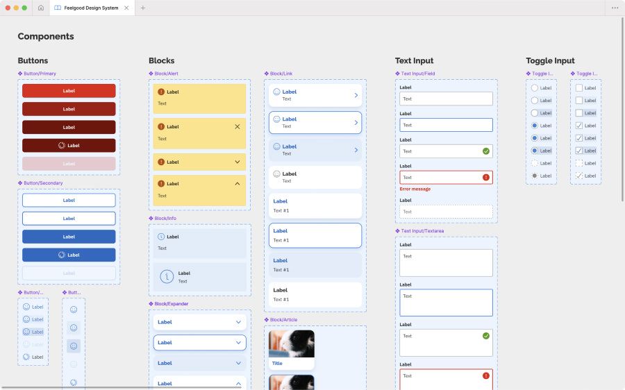
For providing a great and accessible user experience in Feelgood’s solutions, we’ve been using a design system since 2019. It’s currently used in the Feelgood Mobile App, Feelgood Visitor Registration, Feelgood Web Portal, and an internal web app. The design system is available at design.feelgood.se and as a Figma library.
The Feelgood Design System has:
- Made design work more efficient
- Increased quality of our code base
- Improved accessibility in the solutions
- Saved time for our frontend developers
- Made solutions using it look and feel consistent
Feelgood Mobile App
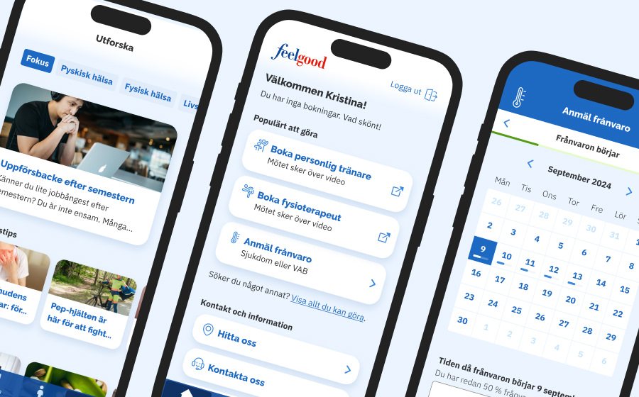
With their app for iOS and Android, Feelgood has made it possible for employees at their clients to manage healthcare bookings, report absence, take health tests, view vaccination history, and use their premium service Feelgood Plus. It was released in the Autumn of 2019.
The Feelgood Mobile App has:
- Been essential for securing new client contracts
- Decreased workload for managers and HR staff at clients
- Given Feelgood a new platform for new offers and features
- Made it possible for client employees to manage private matters
- Saved time for support staff, since employees now need less help
Note: I have not yet written a full case study on this app.
In detail: Feelgood Web Portal
Challenge to solve
The first thing Feelgood wanted to improve back in 2017, was the user experience for managing orders, bookings, complaints, and invoice data. This is done by managers and HR staff at clients organizations.
In 2017, these tasks were done using different web apps that all had inconsistent user interface design and branding and poor user experience, especially on mobile devices. Feelgood knew they had to do better to not lose out on new client contracts.
Goals to achieve
Since we knew what features the Feelgood Web Portal had to have, we set these goals:
- Improve the user experience for each feature
- Provide a consistent look and feel for all features
- Reduce calls about orders and bookings to support staff
- Don’t ask users to enter information we can get ourselves
- Save time for Feelgood staff who manage orders and bookings
- Provide a great user experience on both small and large screens
We decided that these goals should be continuously measured through usability testing, analyzing analytics data, and follow-up talks with Feelgood staff and client representatives.
Learning through meetings and listening sessions
We immediately scheduled listening sessions with the support staff at their call centre. We had to learn about the issues clients were calling about and we wanted to hear it from them directly.
We also set up meetings with staff at Feelgood who were managing orders, bookings, and complaints. We needed to learn what information they had to get from clients and what information clients had to be able to enter on their own.
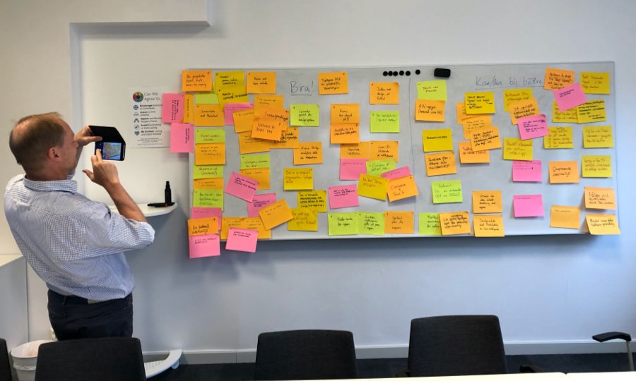
Speeding up decision-making using wireframes
With these insights in mind, I started drawing wireframes of the upcoming web portal. My goal was to elicit additional requirements, help get answers to complex questions, and speed up decision-making by stakeholders.
One wireframe says more than a thousand meeting minutes. It’s a catalyst for decision-making.
Since one of our goals was to improve the user experience on small screens, I worked mobile first and drew wireframes for small screens. This helped us prioritize content and get rid of what was unnecessary. To save time and not get hung up on pixels, I drew on paper.
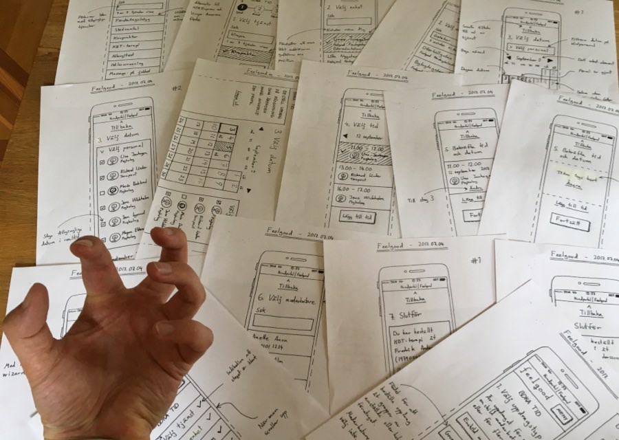
During the following two months, I met with the team and stakeholders several times per week (sometimes several times per day) for discussing and improving these wireframes.
Drawing paper wireframes is great in this phase. It’s cheap, fast, and puts focus on content and functionality. Drawing together also makes everyone feel included.
Keeping everyone in the loop like this proved to be smart. Developers were eased into understanding how to build things and the other stakeholders got pushed into taking high-level decisions.
Making a prototype for saving time
Once everyone was satisfied with the paper wireframes, I made a clickable prototype using Sketch and Invision.
Now, I drew new wireframes for large screens to take advantage of more screen real estate. However, I still drew them in grayscale without much visual flair to keep focus on content and functionality.
We used the prototype for usability tests with clients, presentations for stakeholders, and for explaining interaction design for the developers.
Expanding limiting print guidelines
While wireframing, I was also working on graphic design for the web portal. This was challenging since Feelgood only had guidelines for print design.
Thankfully, I got to expand these guidelines by adding new colors for improving accessibility and a new typeface for rendering numbers better.
Once done, the developers and I created a component library. We started using Sketch, but quickly moved on to HTML, CSS, and Javascript. We wanted to show how colors, typefaces, and components would look and behave in different web browsers on different operating systems on different screens.
Usability testing revealed UX Copy issues
For usability testing the prototype, a coworker at the marketing department and I scheduled interviews with managers at different clients.
We interviewed these managers about the past web apps, but mainly observed them doing pre-planned tasks using the prototype. If they ran into issues and had questions, we discuss it in detail. We had to travel outside of Stockholm for some meetings, but it was well worth the effort.
Everyone completed all tasks with barely any assistance. However, many found the healthcare terminology confusing. We had to simplify UX Copy.
Developing and designing in the browser
Backend development started while I was still wireframing. Working with the backend systems was very challenging according to the developers. Luckily, it didn’t force is to abandon or limit our design.
Frontend development started a bit later, when I was done with the paper wireframes were done. When we finished usability testing the prototype, we picked up the pace. I worked closely with our frontend developer since I was still adjusting the design.
I tried my best not to waste time, but I went back and forth on too many visual details I should have finished earlier.
Release and impact
After started working on the Feelgood Web Portal since April 2017, we released it later in the Autumn. Immediately, it got both great and constructive feedback.
Users thought it was easy-to-use, looked good, and felt professional. They appreciated finally having the features from the different web apps in one place.
The support staff at Feelgood also noted a pleasant decrease in order-related calls after a few months.
Former Feelgood CEO Joachim Morath has mutiple times stated that the Feelgood Web Portal has been an integral part in winning deals with new clients.
“I must say that the new portal feels great, really user-friendly!”
– A user actually wrote this in an email back in 217
“Now that your account manager has presented the web portal, I can simply say one thing – amazing!”
– Client to Feelgood’s marketing department a few years ago
Overall it looks great and seems to work really well. Intuitive to both use and understand.
– Potential new client in 2024
In short, the Feelgood Web Portal has:
- Gotten great feedback from its users
- Been essential for securing new client contracts
- Made it possible to perform tasks on mobile devices
- Helped managers at clients handle more tasks on their own
- Saved time for both clients and Feelgood staff on a daily basis
Fixing new usability issues
Despite successful usability testing and solid initial feedback, usability issues still emerged after release.
Unbearable switching organizations
Some users are linked to multiple organizations. To switch to another organization, they had to sign out and sign in with different credentials. To make this easier, we put a select element in the bottom of the header section. Now, users could switch accounts by just clicking twice.
This worked well for most of these users, but it was unbearable for some of them who were linked to hundreds (!) of sub-organizations at an organization. This broke the design.
We solved this by not listing sub-organizations in the select element. On content-heavy pages, we added the possibility to filter the content for specific sub-organizations.
Missing employee contact information
Clients must regularly supply Feelgood with personnel files. This information is then used when placing orders so users don’t have to look up information for every employee for every new order.
I had been naive and assumed that these files always were tidy and complete, which they weren’t. Therefore, our design offered no way to add a missing phone number or email address when placing orders.
We started getting complaints from clients that their employees had missed scheduled appointments they hadn’t been notified about. We solved this by adding input fields for entering missing information.
Frustrating to find replies to orders
After having placed an order, users can send Feelgood follow-up questions in a message thread on the page for that specific order.
Replies from Feelgood are important and should be read as soon as possible. Therefore, we send users an email when there’s a new reply.
Unfortunately, I had missed that the email template didn’t include a link to the actual page. This was incredibly frustrating for users, who had to go through order by order to find the reply.
We solved this by adding a link to the page in the email template. We also started highlighting orders with new replies in the portal. Now, users could spot them without checking their inbox.
Adding sought-after features
Apart from usability improvements and bug fixes, the web portal has also been updated with new sought-after features since its release.
Sign in using BankID
From a business perspective, adding support for BankID was a must-have feature. Many clients required it for even signing a contract with Feelgood.
English language support
Several of Feelgood’s clients have a substantial amount of native English-speaking employees. Therefore, adding English language support made sense for both accessibility and business reasons.
Manage invoice data
This was a feature we planned to include in the initial release, but couldn’t due to backend limitations. Luckily, this was sorted out a couple of months later.
Feelgood Design System update
In the Autumn of 2021, we made a big visual update by implementing the Feelgood Design System.
Since then Feelgood Web Portal has had the same look and feel as the Feelgood Mobile App and Feelgood Visitor Registration. This update also included general improvements to usability, accessibility, and UX Copy.
While lots of fine-tuning still remains, this update has been well received. Apart from some initial performance issues and a couple of visual bugs, support staff hasn’t noted any complaints.
In detail: Feelgood Visitor Registration
Challenge to solve
After launching the Feelgood Web Portal, the next goal was to make things easier for everyone involved in appointment registration at Feelgood’s 56 health clinics throughout Sweden.
Unfortunately, visitors at these clinics often struggled to register for their appointments because most of the clinics simply don’t have any dedicated staff for welcoming and helping visitors.
Therefore, the treatment staff repeatedly had to go and check if their visitors had arrived or not. This had led to confusion and stress. This is what we were going to solve.
Goals to achieve
We knew we had to design a solution that enabled visitors to register for their appointments on their own and that treatment staff had to be notified of this somehow. We set the these goals for the solution:
- It must be possible to scale nationwide
- Registering must be swift, easy, and accessible
- Treatment staff needs to be notified automatically
- You must be able to call for help if a technical issue arises
Learning about issues by interviewing staff at clinics
For learning about the issues visitors and treatment staff had been facing, we interviewed staff at several clinics without receptionists in Stockholm. We learned that visitors upon registration had to be informed if they were:
- So late they would have to reschedule the appointment
- Several days, weeks, or even months early
- A bit late, but maybe not too much
- On time, but at the wrong clinic
Handling privacy concerns among staff
All the clinics were using the same journal system that had a notification feature. Unfortunately, this feature couldn’t be triggered by a separate solution.
Concerning options, staff was reluctant to try using both SMS or email. They disliked using email, since they didn’t want to have their email clients open for privacy reasons. They disliked using SMS, since they didn’t want to carry around both their work phones and personal phones.
We chose email for notifying staff. Phones can be forgotten and misplaced, but clinics always have computers available.
Concerning privacy, we assured staff that the email subject line wouldn’t contain any personal information about the visitor. It would just say that a visitor for an appointment at a certain time had arrived. They were still a bit reluctant, but agreed to give it a try.
Why we made a prototype right away
After the interviews, I designed a high-fidelity prototype using Sketch and Invision. We decided to skip drawing paper wireframes beforehand. We felt this solution was so simple that it wasn’t needed.
For usability testing, we didn’t even use the prototype and instead did a limited release of the final web app at a clinic in Stockholm. This way we could test everything in the field before a nationwide release.
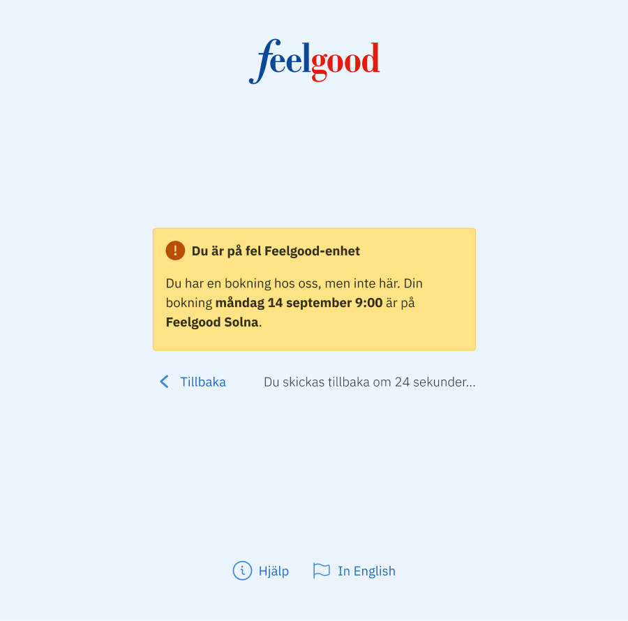
Why we built a web app instead of a mobile app
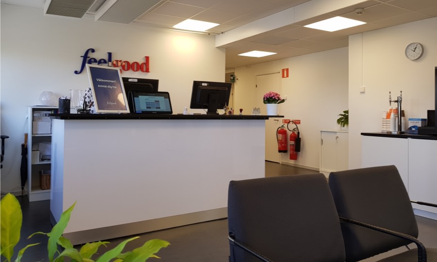
We chose to build web app that would run on tablets placed in the lobby of each clinic. We believed that doing this instead of building native mobile apps would enable us to do quicker updates.
We also wouldn’t be dependent on a using tablets running a specific operating system.
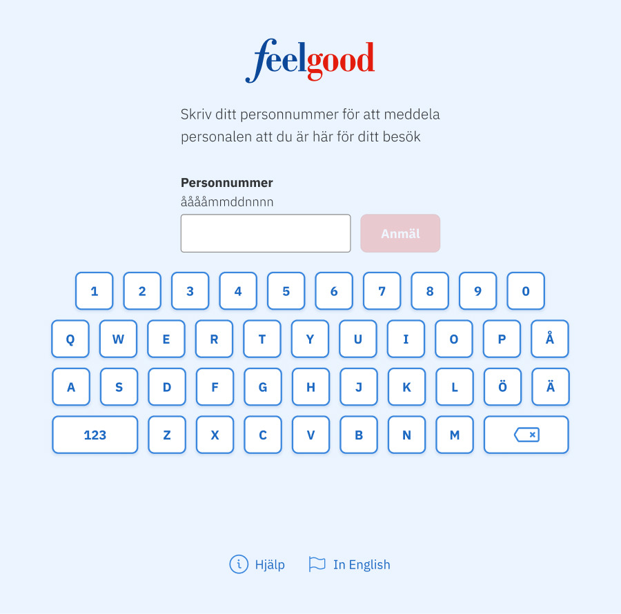
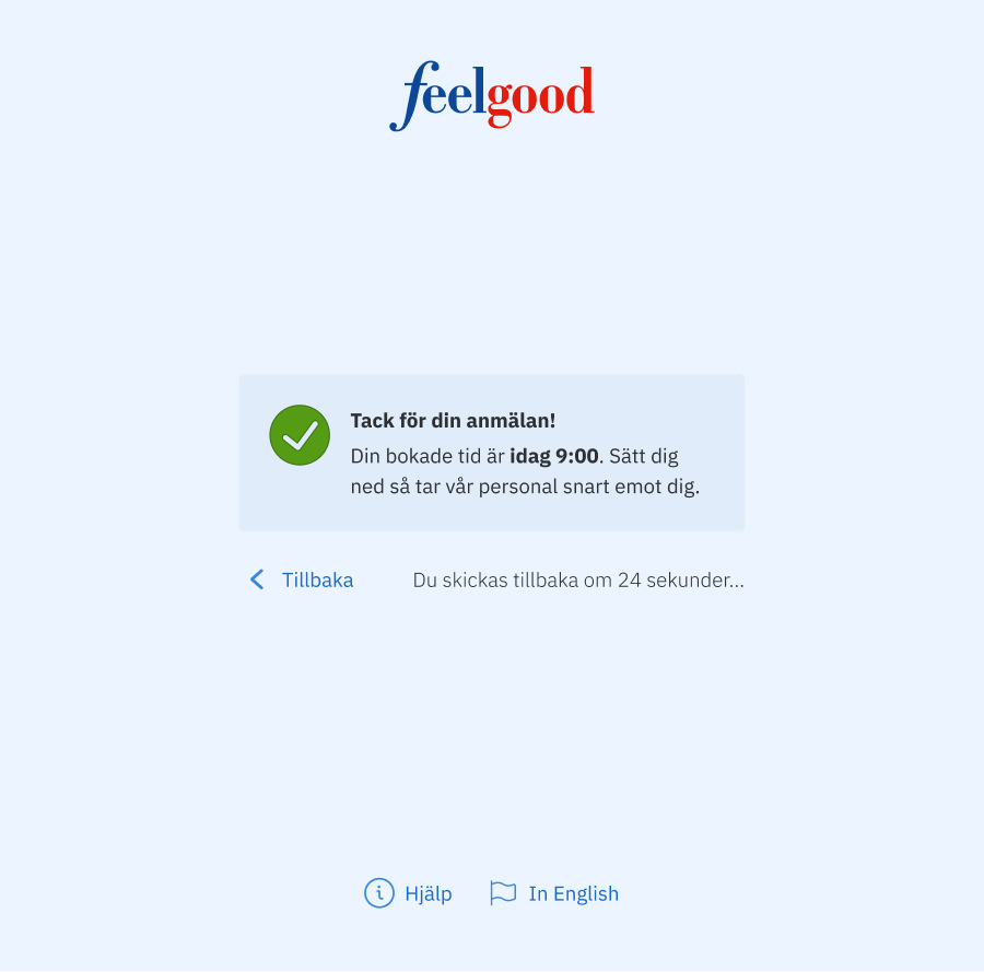
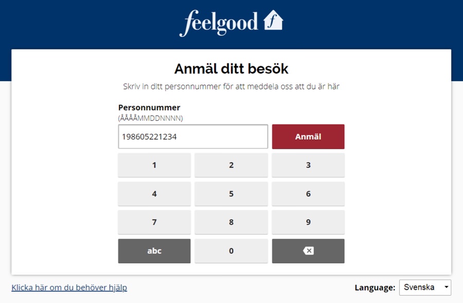
How the web app works:
- A visitor enters a Swedish personal identity number
- The journal system is searched for a linked appointment
- The staff member gets an email when the appointment is found
- The visitor is informed that the appointment was found
If visitors are too late, they are told how to make a new appointment. If the registration fails due to a technical issue, we show a phone number they can call.
Feedback after limited release
It took two days to set up the tablet at the first clinic and instruct the staff how to manage it. We all agreed that they would get back to with feedback after two months.
After two months, we learned that:
- It worked well for both visitors and for staff
- Staff liked not having to ask visitors for ID any more
- It was easy to manage and our instructions were great
- There had been no technical issues regarding the tablet
- Some staff continued to use the journal system, which led to confusion
However, it also had usability issues:
- Appointments created in the journal system just before their time slots were sometimes not found
- Visitors didn’t understand they had to enter the full year in their personal identity numbers
- Registrations failed if a staff member didn’t have an email address in the journal system
- Some staff members missed emails due to settings in their email clients
- When the tablet screen got dirty, it got hard to read
- Some visitors found the text too small to read
Fixing the usability issues
This is how we solved the usability issues, including a new one we found on our own.
New format for personal identity number
Despite explaining that visitors had to enter their personal identity numbers using the format YYYYMMDDNNNN, we added support for YYMMDDNNNN. It was just lazy of us to not support it initially.
Importing data more frequently
The developers solved the issue that recently created appointments sometimes weren’t found by importing data from the journal system more frequently, every tenth minute to be exact.
Tips for configuring email clients
Since some staff members hadn’t set up notifications in their email clients, we added instructions for this in the guide we sent to each clinic. We also recommended that they should clean the tablet screen regularly.
Increasing text size
Even though no text was smaller than 16 pixels, some visitors still had trouble reading. Hence, we simply increased the text size in general. This was great reminder that you can’t achieve great accessibility by just following WCAG, you have test with users too.
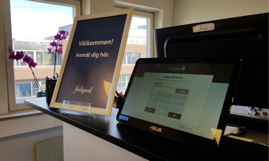
Putting up posters about the tablet
When we visited another clinic and observed their visitors, we noticed some of them didn’t understand that there even was a tablet to use. They just sat down and waited.
Afterwards, we put up posters next to the tablets that told visitors what to do. It was embarrassing that we hadn’t thought of this before, but that’s why you do usability testing.
Impact after nationwide release
Today, Feelgood Visitor Registration is used at more than 35 of Feelgood’s 56 health clinics throughout Sweden. In short, it has:
- Helped clear up appointment misunderstandings
- Saved time for treatment staff at clinics on a daily basis
- Made it possible for visitors to register for appointments
Feelgood Design System update
In the Spring of 2021, we made a big visual update by implementing the Feelgood Design System.
Since then, the Feelgood Visitor Registration has had the same look and feel as the Feelgood Mobile App and Feelgood Web Portal (updated in the Autumn of 2021).
We notified the clinics about this update and the reasons why months in advance. There were no issues after the update, everything continued to work just as well as before.
In detail: Feelgood Design System
Challenge to solve
For providing a great and accessible user experience in all of Feelgood’s digital solutions, we’ve been building and using a design system since 2019. We call it FDS, Feelgood Design System.
Design systems have been a hot topic in the design community for several years. Many agree that they are challenging to make, but perhaps even harder to maintain and put to use. Therefore, the team and I had a humble approach when we started working on our.
Goals to achieve
After having read articles, discussed needs and expectations at Feelgood, and talked to experienced coworkers at inUse, we decided that FDS should:
- Be a guide for designers, developers, and marketing staff
- Initially be catered for our frontend developers
- Be compliant with the latest version of WCAG
- Easily be accessed using a web browser
- Focus on what our solutions need
- Constantly be improved
Deciding on a design system
After having released the Feelgood Web Portal and Feelgood Visitor Registration, the next project was a mobile app for which higher-ups at Feelgood felt we needed a new graphic profile.
I argued for that we should start working on a design system to coincide with this work. The team and other stakeholders agreed after going back and forth for a couple of weeks.
With the growing number of solutions, all stakeholders realized it would be efficient to have as much as possible of our frontend code in a single codebase.
Getting assistance with graphic design
Creating this new graphic profile was too big of a task for me to pull off on my own, I needed some help.
Luckily, my coworker and seasoned graphic designer Johan Kuno was available. He joined our team on part-time for a couple of months and immediately started working on the basics:
- Icons
- Colors
- Imagery
- Typography
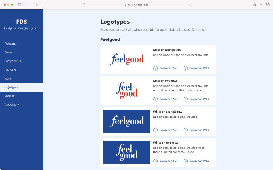
- Logotype variants
We decided to work in Sketch and share and discuss drafts using Zeplin. Kuno did the majority of the graphic design, while I mainly reviewed it and gave pointers. I loved our lengthy discussions that covered everything from overall look and feel to tiny details.
Choosing a diverse icon library
For Feelgood’s previous solutions, I had struggled a bit to find matching free-to-use SVG icons. This approach wasn’t going to cut it any longer, we needed a proper icon library.
Kuno and I had look at several libraries before going with Streamline. This library has an impressive amount of well-categorized icons available in multiple variants. It’s also used by Booking.com.
Expanding the color palette, twice
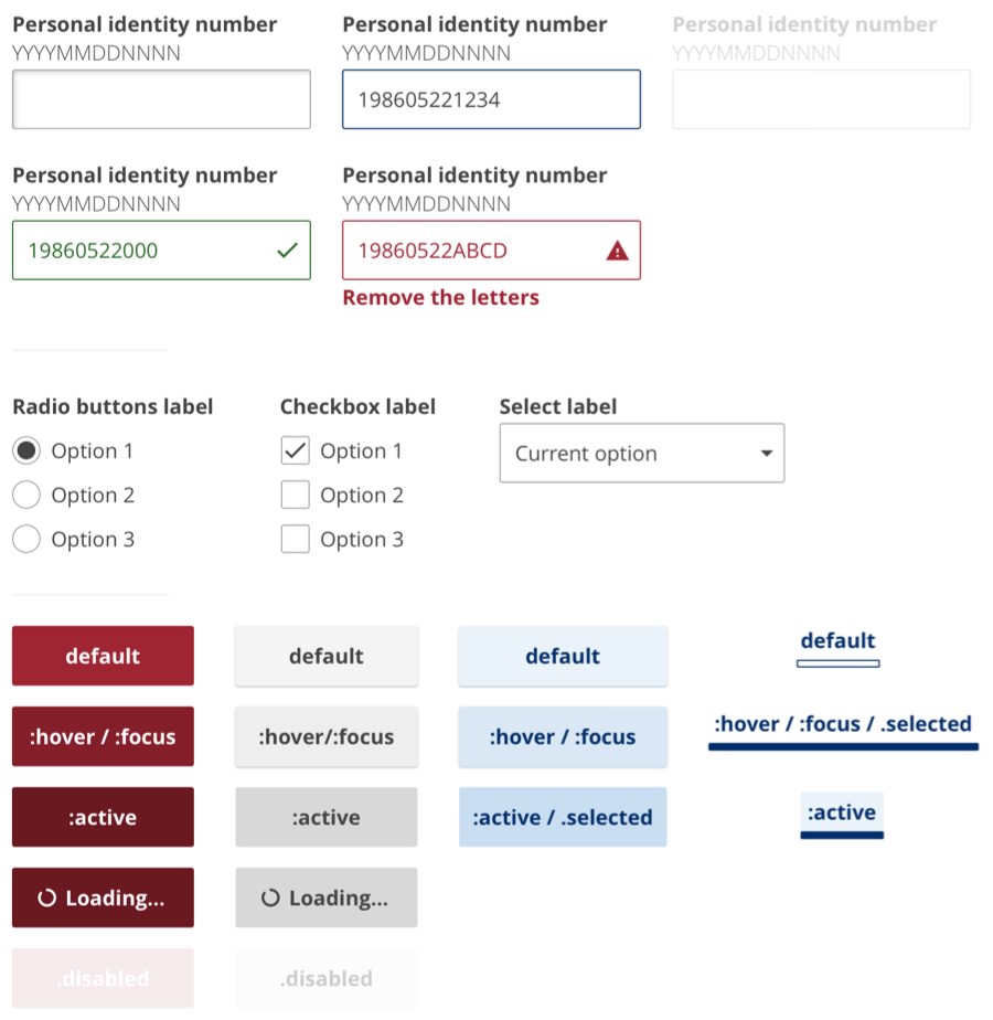
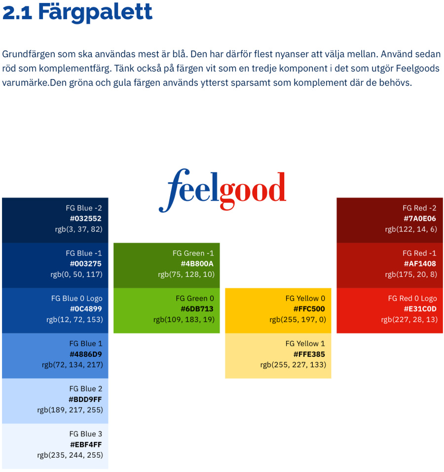
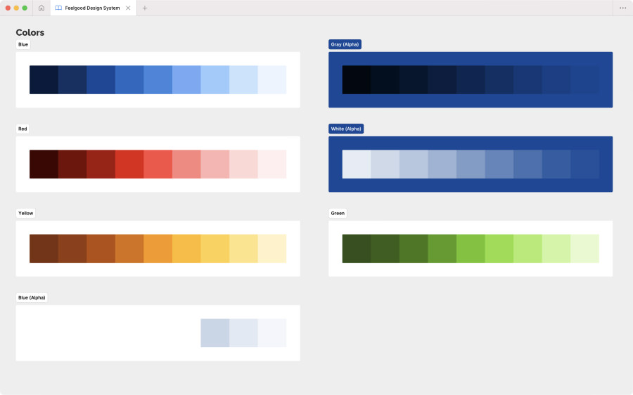
For the color palette we stayed close to Feelgood’s current choice of blue, red, and white, but we made some nice adjustments to make them look better on screens.
Even though we added some much needed shades of these colors for making components, we should have added even more to be future-proof. By early 2024, I had finally edited and expanded our palette.
Switching typeface for improving accessibility
While work on the new graphic profile went well, we did screw up when selecting a new typeface for body text.
I was late to notice that our initial choice of Open Sans rendered characters like I, l, and 1 too similarly. This would have been a problem for users handling IDs, invoice references, and other pieces of text with random characters.
After convincing the slightly reluctant marketing department who had already started using Open Sans in their material, we got to replace it with IBM Plex Sans (used on this website) that didn’t have this accessibility issue.
IBM Plex Sans also came with a performance boost, since it was available as a variable font file.
Making just the needed components
Since Kuno’s time was running out and he still had some concept to do for the mobile app, we focused on just making the components the app needed. Since I had already done some wireframing for it, we were well prepared.
It was tempting to design as many components as possible, but we had been advised to just focus on what was really needed.
Making a few more needed components
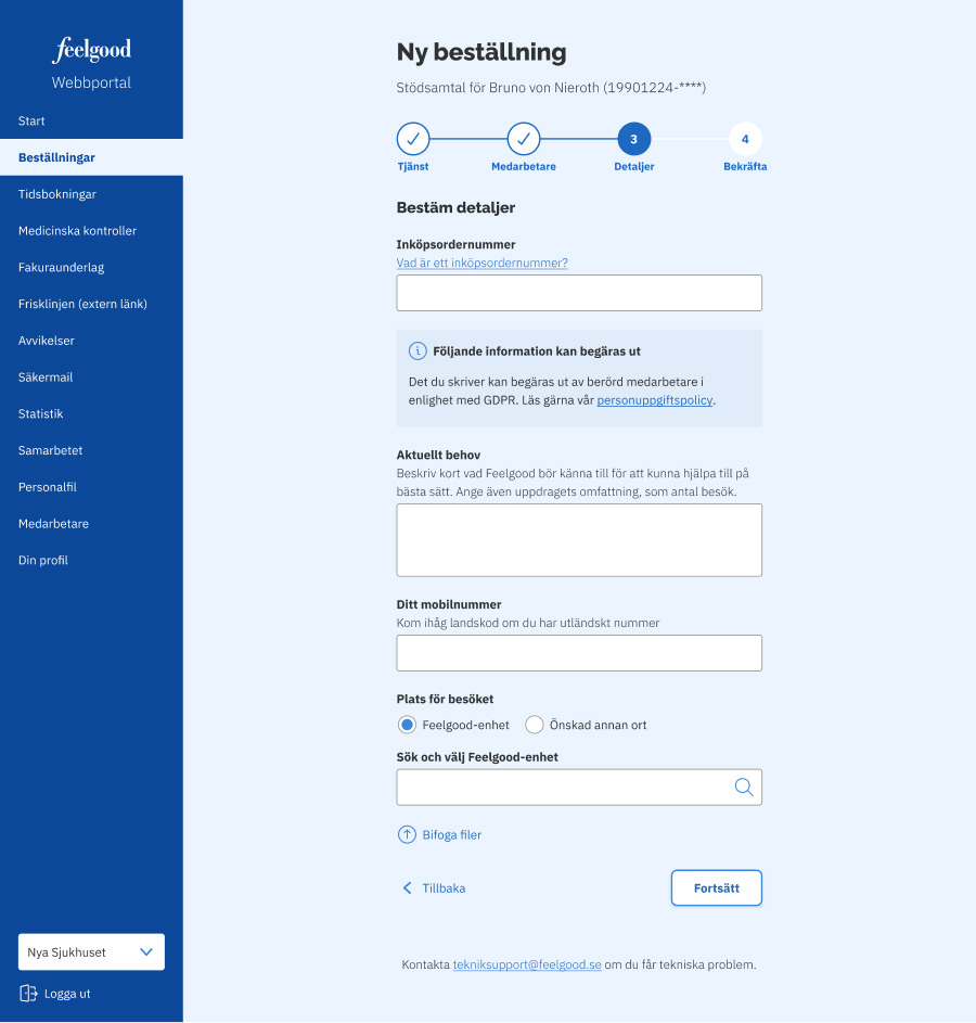
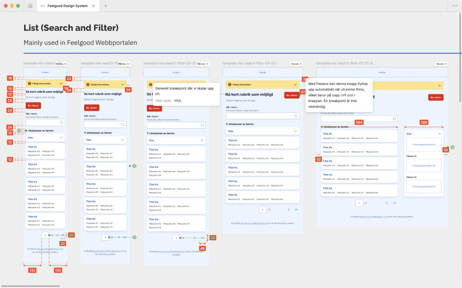
After Kuno finished the concept work for the mobile app, we spent his few remaining hours redesigning the Feelgood Web Portal using the new graphic profile. This led to new components, such as:
- Modal, for showing and asking for more information
- Wizard, for asking for information step by step
- Textarea, for entering longer amounts of text
- Sticker, for highlighting something important
- Tabs, for dividing content on the same page
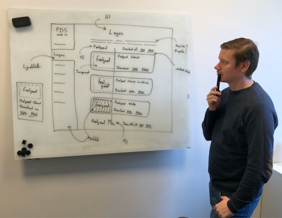
Why we put the design system on a website
For making our design system easily accessed and interactive, we decided to put it on a website for the following reasons:
First, different web browsers render things differently on different types of screens. What looks perfect in Figma on Macbook will probably don’t look perfect “in the field”.
Second, everyone would be able access it without having to sign up for Figma and ask for an invite just to download a logotype or copy a HEX color code.
Third, the website could use the same tech stack (Vue.js) as Feelgoods other digital solutions and save us a lot of development time.
Fourth, all components could more easily be made interactive for touch, keyboard, and mouse input.
Our plan for regular feedback
With limited time on our hands, the team and I decided to ship a first version with just the basics and then gradually add more.
In between the updates, we were going to share the website with designers and developers for feedback. The first version included:
- Icons
- Colors
- Spacing
- Typography
- Print guidelines
- Logotype variants
Initial release and feedback
As planned, we shared the first version of design.feelgood.se with a handful of designers at inUse. We learned that:
- Some download links were easy to miss
- It felt catered to developers, but not too much
- The website was simple, clean, tidy, and looked good
- Our home page could be more welcoming and guiding
- Logotype variants needed instructions how to be used
- Colors looked great, but also needed these instructions
- Spacing was well presented, but also needed these instructions
- Typography was presented well, especially the links to Google Fonts
Every designer we shared the design system with asked us to add components as soon as possible
Pandemic postponement
Two weeks after the first release, we shipped an update with small improvements before having to focus on Feelgood’s other solutions.
In February 2020, we were about ship an update with our components. Then, the Covid-19 pandemic hit Sweden and planned work on the design system was postponed. However, I still had time to improve our Sketch library and migrate it to Figma before the end of the year.
In November 2022, we finally updated the website with most of the components and some minor tweaks to some existing content!
During 2023, focus was once again put on Feelgood’s other solutions. However, I made several big updates to the Figma library including improving components using variables and component properties.
For 2024, we’re preparing another big update for the website including switching from using Stencil to Storybook for managing the components.
Impact today
Today, Feelgood Design System is used in the Feelgood Mobile App, Feelgood Visitor Registration, and Feelgood Web Portal.
It’s also gradually being implemented in Feelgood Client Management, an internal data-heavy web app I’ve only been slightly involved in.
As a designer, it’s great to have FDS to rely on. Having everything lined up in Figma saves me a lot of time on a daily basis.
The Feelgood Design System has:
- Made design work more efficient
- Increased quality of our code base
- Improved accessibility in the solutions
- Saved time for our frontend developers
- Made solutions using it look and feel consistent
Finally, how working at Feelgood has been
Working at Feelgood is the best and definitely most challenging consulting gig I’ve ever had.
Helping people get better healthcare and improve their well-being is the main reason I’ve stayed with them since 2017. My fun and awesome team members is another reason.