
How to make great wireframes in Sketch
Posted on January 30, 2018
In recent years, Sketch has risen to one of the top vector graphics editors among designers. I use it several times a week at work and I love it! Here are my tips for making great wireframes in Sketch
When I started working as an IT consultant in 2011, my designer colleagues all used different vector graphics editors. Today, almost everyone of them uses Sketch exclusively.
If you’re making wireframes, creating a style guide or drawing illustrations Sketch is the perfect tool! It’s popular, not overburdened with features and costs much less than editors like Photoshop.
Here are my best pieces of advice when making wireframes in Sketch.
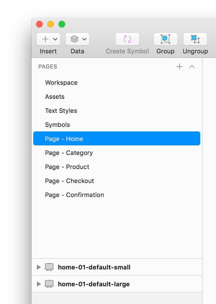
Organize your screens with Pages and Artboards
As your wireframes grow, keeping all screens organized is essential for staying efficient. Hence, you should make use of Pages and Artboards.
Create a Page for each set of related screens
In Sketch, a Page offers a new blank canvas. There’s no reason to put all of your screens on the same Page. Instead, create a Page for each set of related screens of the app or website your making wireframes for.
If I was making wireframes for a website where you buy stuffed animals, I’d create the following Pages:
- Workspace (a “workbench” for creating whatever you need)
- Assets (for logos, photos and so on)
- Text Styles (for just my Text Styles)
- Symbols (automatically created by Sketch)
- Home page (for latest offers and news)
- Category page (for different categories of stuffed animals)
- Product page (for a specific stuffed animal)
- Checkout page (for entering address and payment information)
- Purchase confirmation page (for confirming the purchase)
On a Page, create one Artboard for each screen variant
Since each screen is likely to have multiple variants, I’d recommend creating one Artboard for each of them. All the Artboards you create are automatically placed on the selected Page.
When you create a new Artboard you can set its width and height how you like, but Sketch also offers presets based on popular devices and screen resolutions.
What a screen variant is, is up to you. I usually make variants for different screen sizes and for showing how the interaction design is supposed to work in detail.
For the checkout page for the stuffed animals website, I’d create Artboards for the following screen variants:
- No address or payment information entered
- For small screens
- For large screens
- Correctly entered address and payment information
- For small screens
- For large screens
- Incorrectly entered address and payment information
- For small screens
- For large screens
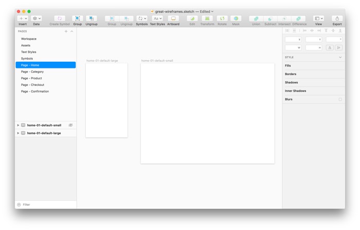
When it comes to naming the Artboards, I recommend using the naming pattern name-number-modifier-size.jpg. Using this pattern, your team members are more likely to be able to identify the content of an exported Artboard without having to open it.
Here are some examples:
- checkout-01-default-small.jpg
- checkout-02-delivery-address-search-small.jpg
- checkout-03-correct-payment-information-small.jpg
- checkout-04-incorrect-payment-information-small.jpg
Tip: Make sure an exported Artboard is identifiable by its name. A name like checkout-03-correct-payment-information-small.jpg is great, a name like screen21.jpg is terrible.
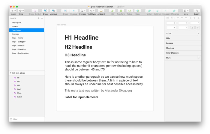
Make use of Text Styles
You’ll be using text to some extent in you wireframes and when need to adjust the font size or change the typeface altogether, it’s an enormous waste of time and energy having to do it on each and every screen.
Luckily, Sketch offers the ability to save and reuse your design choices using Text Styles. Once a Text Style is saved it can be applied to new pieces of text. If you change a Text Style, it will affect all pieces of text using that Text Style.
Whenever I start working on a new project, I create Text Styles for common pieces of text like:
- H1 headline
- H2 headline
- H3 headline
- Body text
- Meta text (for dates, timestamps, input hints and so on)
- Input labels (for input fields and groups of radio buttons and checkboxes)
Set up a naming convention
Just like web developers (hopefully) have a set of rules for naming their CSS classes, you should set up a naming convention for the Pages, Artboards, Symbols and Text Styles you’ll be using.
It’s a good idea to use the same (or a very similar) naming convention that the developers are using. If you share your wireframes with them using tools like Zeplin, there will be less confusion and second-guessing if you all use the same names for the same components.
For example, if your development team have named the CSS class for styling a website’s primary buttons “button-primary” you should use that name instead of something like “call-to-action”.
Tip: Imagine that your creating a naming convention for someone else and not just for yourself. Ask someone else if your terminology makes sense.
If you’re looking for a real life example of a naming convention, have a look at the Trello CSS Guide or BEM.
Master the power of Symbols
Symbols is probably the best feature in Sketch. It’s like Text Styles, but for all combinations of shapes and pieces of text. It’s powerful and will save you a lot of time in the long run.
Tip: Save logos and icons as Symbols too.
For example, let’s say you create an input field with a label and an input hint and want to reuse it on more screens. By saving these three elements as one Symbol, it’s now stored in your library and can be used anytime you want.
If your Symbol contains text, you can override the pieces of text for all instances of that Symbol. Changing the text (not its design) will not affect the other instances.
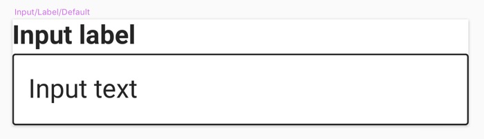
If you later edit this Symbol, the changes will affect all instances of it.
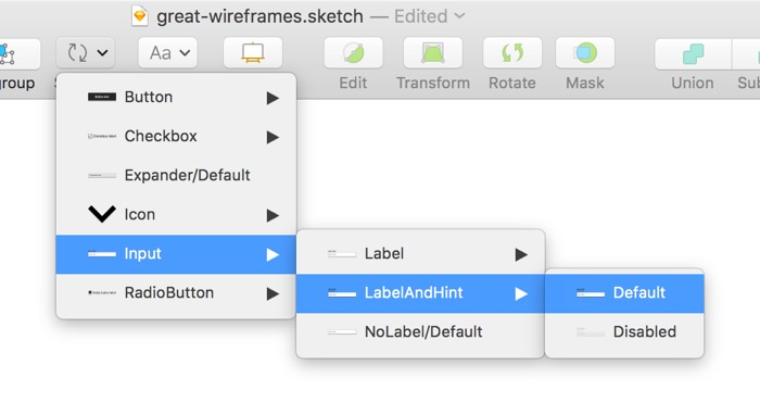
Name your Symbols with slashes
Since you probably will create lots of Symbols, you should put slashes (/) in their names for organizing them neatly.
When you put a slash in names of Symbols, Sketch will automatically create subgroups of them making it easier to find the ones you’re looking for.
I’d recommend using these two naming patterns:
- category/type/state
- category/type/variation-state
Tip: Stick to a maximum of two slashes so you only have a depth of three layers (that has worked best for me so far).
Here are some examples of named symbols based on these two patterns:
- button/primary/default
- button/primary/disabled
- button/secondary/default
- button/secondary/disabled
- input/nolabel/default
- input/label/default
- input/label/disabled
- input/labelandhint/default
- input/labelandhint/disabled
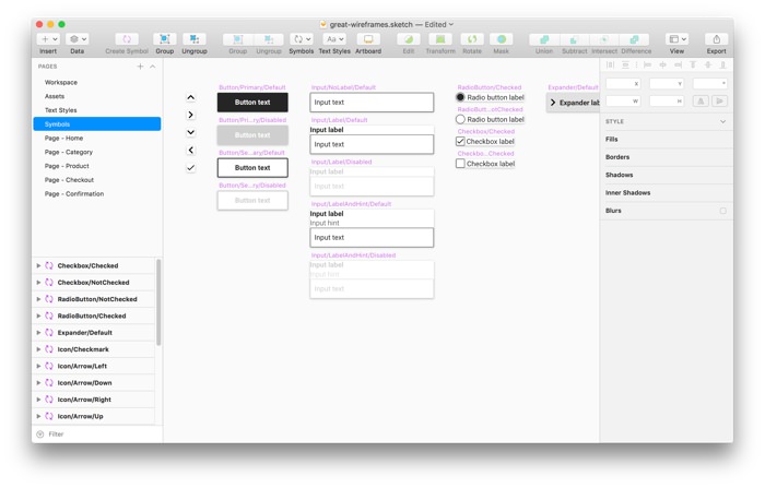
Create a library of common Symbols
Sketch offers common shapes like rectangles, circles, triangles and arrows. There’s no need to redraw these, but you should use them to create common interface components like buttons, input fields, date pickers and modal windows.
For example, I always create Symbols of common components in different states such as:
- Buttons
- Primary
- Default state
- Disabled state
- Secondary
- Default state
- Disabled state
- Primary
- Checkboxes with text labels
- Checked
- Not checked
- Radio buttons with text labels
- Checked
- Not checked
- Expandable blocks
- Not expanded
- Expanded
- Input fields
- With just a label
- Default
- Disabled
- With both a label and an input hint
- Default
- Disabled
- With just a label
There are lots of ready-made interface components you can download and use for free, but I’d recommend creating your own library. You’ll learn more about using Sketch and end up with less unused Symbols.
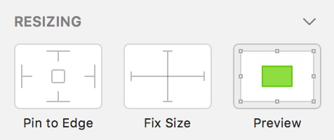
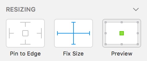
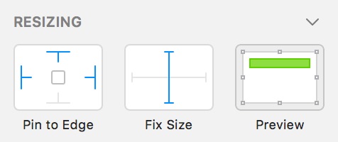
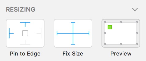
Make your symbols responsive
When making wireframes today, you’ll probably need to create different variants of your screens for different screen sizes. One variant for small screens, one for large screens and perhaps one for medium sized screens.
This means you should set up your Symbols so that their layout don’t break when you stretch them horizontally or vertically.
Luckily, Sketch handles this excellently! For each element included in a Symbol, you can set up how it will behave when the Symbol is stretched using a control in the properties column to the right.
Here are some of the settings you can make for a selected element in a Symbol:
Presenting the wireframes
When presenting your wireframes to the developers in your team, you have several options.
Some developers prefer having a look in the Sketch file directly, others prefer having your screens exported to images and some prefer tools for making clickable prototypes like InVision.
Tip: Treat the developers in your team like users. Serve them your wireframes the way they prefer.
If inVision sound interesting, please read my post Prototype like a pro with inVision.
Don’t use layers in your Sketch files
Based on my experience working with developers, you shouldn’t use layers on your screens in Sketch. I think this way of working used to be the norm when Photoshop reigned supreme.
Most developers I’ve worked with find it annoying having to hide and show lots of (often poorly named) layers to learn how a screen looks and behaves. Instead, just use more Artboards for presenting the different screen variants.
Further reading
A lot of great articles have already been written about using Sketch. Here are my favorites:
- Responsive Design in Sketch – Part 1 by Emin Inanc Ulu
- Unleashing The Full Potential Of Symbols In Sketch by Javier ‘Simón’ Cuello
- Sketch symbol best practices (now that nested overrides are a thing) by Lloyd Humphreys
Is there anything you think I should add, remove or change in this post? Let me know in the comment section.
Oh, by the way! If this type of wireframing is a bit too much for your project, please read my new post How paper wireframing will make you a better designer.
/Alexander